19. Your First Python Script: Load a FRED Series and Plot It in Ten Lines
· Updated on · 11 min read
In 2010, two Harvard economists, Carmen Reinhart and Kenneth Rogoff, publish a study that will weigh on policy across the planet. Its thesis: beyond a public debt of 90% of GDP, growth would collapse — their figures even showed an average contraction of −0.1%. In the thick of the European debt crisis, that 90% threshold becomes the knock-down argument of austerity's advocates, quoted by ministers and commissioners.
Three years later, Thomas Herndon, a twenty-eight-year-old graduate student at the University of Massachusetts, tries to replicate the result for an econometrics assignment. He cannot. He asks the authors for their working spreadsheet and uncovers three distinct problems: an Excel formula limited to rows 30–44 rather than 30–49, excluding five countries; the selective omission of available years; and an unconventional weighting method that gives each country equal weight regardless of how many years it contributes. Correcting all three raises the mean growth rate for debt episodes above 90% of GDP from −0.1% to +2.2%. The spreadsheet error, striking as it is, does not by itself explain the full gap; and correcting the figures still does not say which of the two, debt or growth, commands the other.
What the replication actually corrected
- Coding error: five countries were omitted by a mis-specified Excel range.
- Data exclusions: some available years were left out.
- Weighting: each country received equal weight regardless of how many years it contributed.
Combined effect: −0.1% published → +2.2% after correction.
The spreadsheet error was not, on its own, the heaviest of the lot — a questionable weighting mattered more. But it became the symbol of a deeper ill: an opaque, unversioned, un-replayable spreadsheet had propagated a blunder all the way into global economic policy. That is precisely what a few readable, shareable, re-runnable lines of code would have made almost impossible. That is why this final workshop moves you from mouse to keyboard: not to show off, but to make your work reproducible. By the end, you will know how to load a FRED series and plot it in ten lines of Python. And you will never do a Reinhart-Rogoff.
At a glance — Hands-on workshop · Level: Intermediate · Prerequisites: chapter 18
By the end of this workshop, you will be able to:
- load a FRED series and plot it in ten lines of Python, with nothing to install;
- build quantities FRED does not publish — deflator, velocity, moving average;
- recognise the three errors that stop every beginner, and fix them in one line.
No prior knowledge of Python is assumed. The section "Making a chart speak" is markedly more advanced than the rest: it can wait for a second reading.
Why code, after the mouse?
In the previous chapter, you learned to do everything in FRED with a mouse. So why code? For three reasons only the keyboard offers. Reproducibility, first: a script says exactly what it does, can be re-read, corrected, shared — where a click leaves no trace. Scale, next: drawing one chart with a mouse is easy, but drawing a hundred, recomputing an inflation rate every morning, crossing ten series, requires automation. And power, last: once the data is in memory, all the computation in the world opens up.
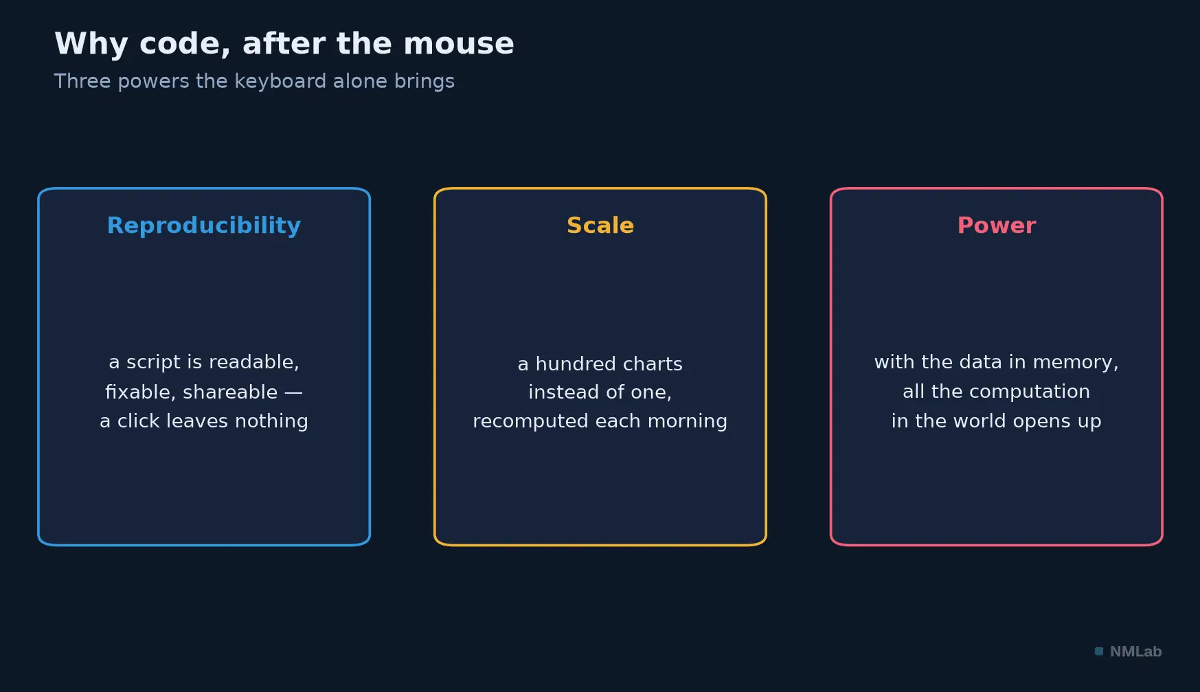
What the mouse cannot do: replay, repeat endlessly, compute. That is exactly what you gain by switching to the keyboard.

The tool you will use, the pandas library, was not born by chance in this context. Wes McKinney created it in 2008 while working at an investment fund, precisely because he needed a reliable tool to analyze financial data without slipping up. Made public at the end of 2009, it became the Swiss army knife of anyone handling data. Its very name tells its lineage: pandas, for panel data — econometrics' panel data — and Python data analysis.
Getting started without breaking anything
Good news: you have nothing to install. The simplest path for a beginner is Google Colab (colab.research.google.com): a code notebook that runs in your browser, for free, with Python, pandas and matplotlib already set up. A Google account is enough; you open a new notebook, paste the script, click "run." Nothing to download, nothing to configure. (If you'd rather work on your own machine, modern tools like uv install Python and its libraries in seconds; but save that for later.)
Ten lines, one chart
Here is the complete script. Don't be intimidated: ten lines in all, eight of them code, and we'll unpack them right after.
import pandas as pd
import matplotlib.pyplot as plt

url = "https://fred.stlouisfed.org/graph/fredgraph.csv?id=GDPC1"
df = pd.read_csv(url, parse_dates=["observation_date"], index_col="observation_date")

df.plot(title="US real GDP (GDPC1)", legend=False)
plt.ylabel("Billions of 2017 dollars")
plt.tight_layout()
plt.savefig("gdpc1.png", dpi=150)
Run it, and here is what appears:
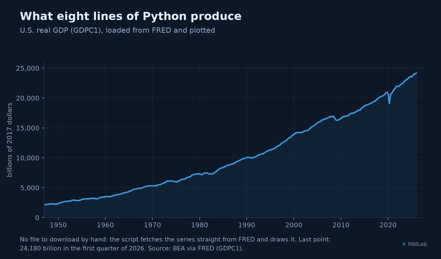
Eight lines, and the whole history of American output since 1947 appears — up to the 24,180 billion of the first quarter of 2026, COVID trough included.
Let's go line by line. The first two import the tools: pandas for the data (renamed pd by convention) and matplotlib for the drawing (plt). The third builds the series' address: notice you simply paste the identifier GDPC1 — the very one you learned to spot in chapter 18 — at the end of FRED's CSV export URL. The fourth line is the heart: pd.read_csv downloads and reads the file in a single instruction, without your having to save it by hand. The last two plot the chart, dress it, and save it as an image. That's it. You have just done, in a script you can rerun at will, what once took a manual save and a spreadsheet.
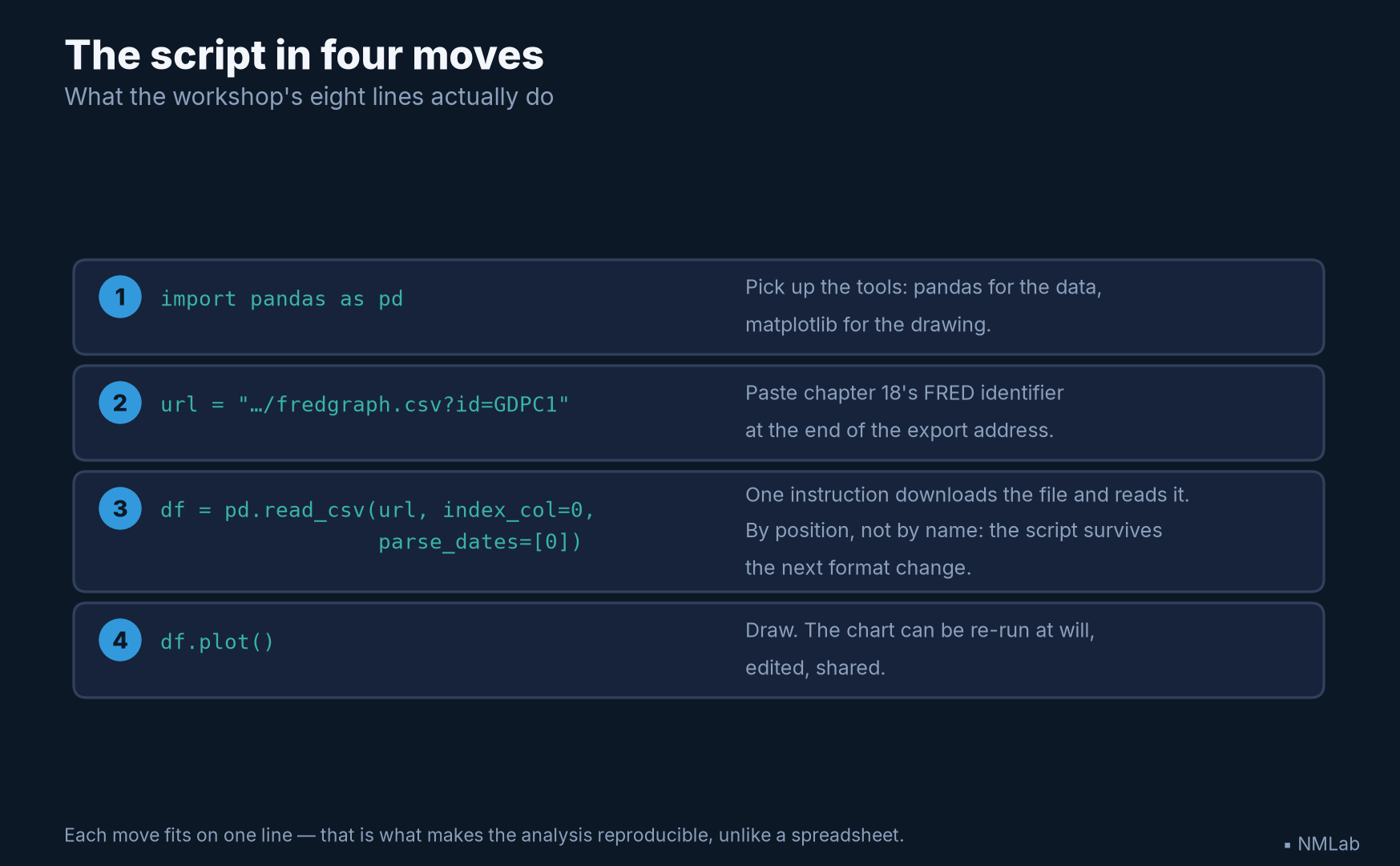
Each move fits on one line — and it is the third, the one that names the column by position, that will make your script bulletproof.
The trap that breaks every old tutorial
One detail of that fourth line deserves a stop, because it trips everyone up. We wrote parse_dates=["observation_date"]. Yet if you consult a tutorial written before the end of 2024, you'll read parse_dates=["DATE"] — and your script will crash at once, with a stern message:
ValueError: Missing column provided to 'parse_dates': 'DATE'
The reason? FRED renamed the date column of its CSV files: it was called DATE, it is now observation_date. The change came in December 2024, and it broke, overnight, thousands of scripts and tutorials. The lesson goes beyond the special case: data formats change under your feet, without warning. To guard against it, prefer a form that doesn't hard-code the name — designate the first column by its position:
df = pd.read_csv(url, index_col=0, parse_dates=[0])
That way, whatever the date column is called, your script will survive the next change. It is the very reflex of reproducibility.
There is, in fact, an even shorter path that dodges this trap entirely: the pandas-datareader library, which talks to FRED directly, without a URL. Two lines suffice:
from pandas_datareader import data as web
df = web.DataReader("GDPC1", "fred", start="1947-01-01")
It is convenient, and normalizes the column name for you. We detailed the URL method all the same, because it is the most robust — it depends on no extra software layer, and it shows you, bare, what is really happening: a file you download and read. Understanding the long version is never being a prisoner of the short one.
Transforming, in one line
Once the series is in memory, all of pandas' power opens up. Remember FRED's "Change from year ago" dropdown? In code, it is a single instruction. Since GDP is quarterly, you compare each quarter to the one a year earlier — four quarters back:
growth = df.pct_change(4) * 100
growth.plot(title="US real GDP growth, year over year (%)", legend=False)
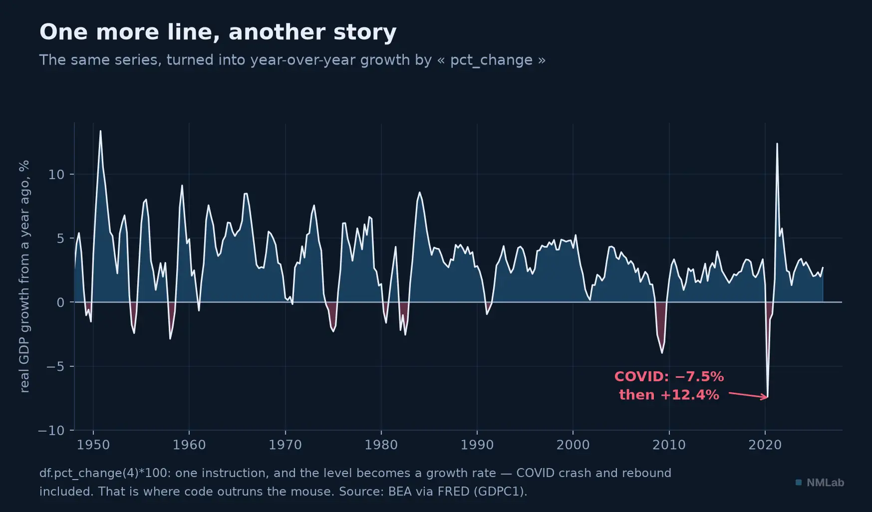
One instruction, pct_change(4), and the level becomes a growth rate. The COVID crash (−7.5%) and its spectacular rebound (+12.4%) leap out — invisible on the level curve.
The level, unreadable to the eye, has become the growth rate, the variable that matters. That is precisely where code outruns the mouse: the same transformation, you can apply to a hundred series at once, or recompute every morning on the latest data.
Three indicators from this journey, one line each
The real gain is not plotting faster: it is building quantities FRED does not publish. Three of them, met along this journey, take one line each once the series are loaded.
The GDP deflator of chapter 10 is nothing but the ratio of nominal to real. Load GDP and GDPC1 — both quarterly, hence directly comparable:
deflator = gdp["GDP"] / gdp["GDPC1"] * 100
The velocity of money, which will later decide whether a rise in money ends up in prices, is nominal GDP over the money stock. Mind the trap here: GDP is quarterly, M2SL is monthly, and dividing two series of different frequencies produces nothing but holes. The second must first be brought back to the quarter:
velocity = gdp["GDP"] / m2["M2SL"].resample("QS").mean()
Finally, the anti-noise reflex of chapters 6 and 7 — one month is noise, three months the beginning of a signal — is one method call:
trend = inflation.rolling(3).mean()
None of these three exists as an off-the-shelf series in this form; each is yours the moment you write it, and recomputes itself on today's data at every run. That is exactly the border between consulting numbers and analyzing them.
Making a chart speak
Let's push one step further, to recover the recession bars of the previous chapter — this time in code. Three moves suffice: also load the USREC series (the NBER recession indicator, which is 1 during a recession, 0 otherwise), find the intervals of 1, shade each with axvspan.
rec = pd.read_csv(
    "https://fred.stlouisfed.org/graph/fredgraph.csv?id=USREC",
    index_col=0, parse_dates=[0])
ax = df.plot(legend=False)
in_recession = rec["USREC"] == 1
starts = rec.index[in_recession & ~in_recession.shift(1, fill_value=False)]
ends = rec.index[in_recession & ~in_recession.shift(-1, fill_value=False)]
for start, end in zip(starts, ends):
    ax.axvspan(start, end, color="grey", alpha=0.3)
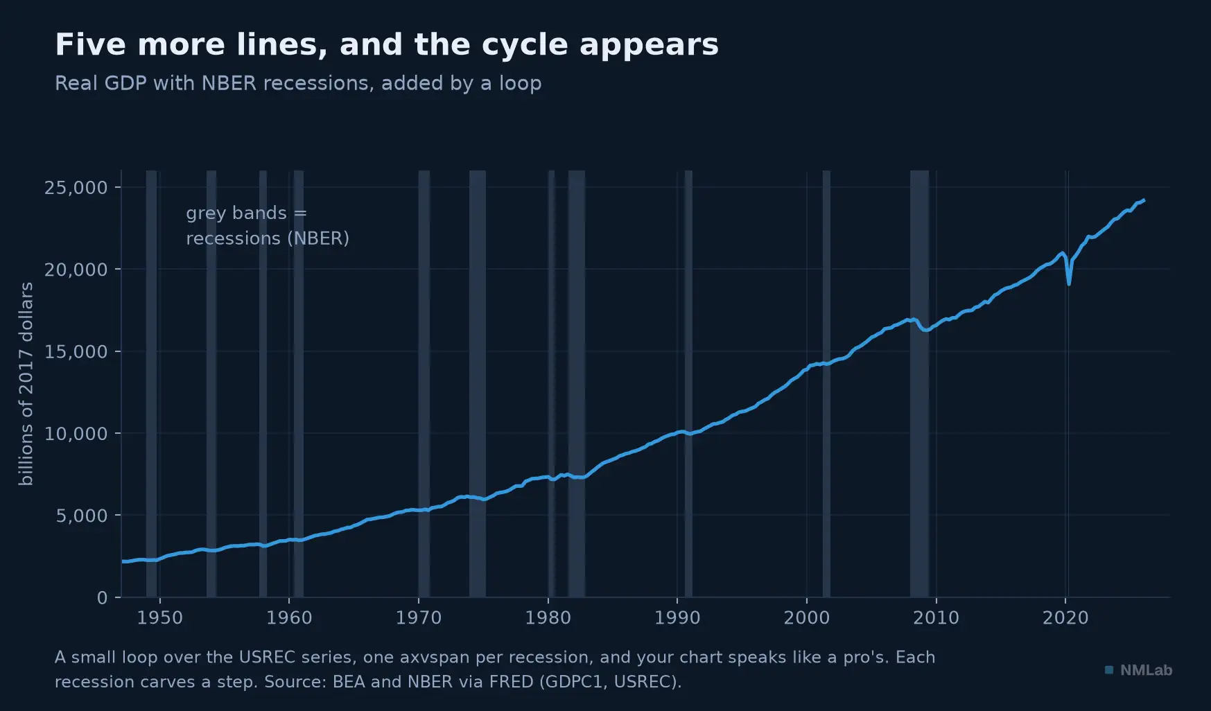
Five more lines, a little loop, and your chart speaks like a professional's: every recession carves a visible step.
Don't worry about understanding it all at first glance: what matters is seeing that in a handful of lines, you reproduce — and automate — what FRED does with a click. The difference is that your version is yours: rerunnable, editable, shareable.
When it breaks (and it will)
One last piece of advice, the most useful of all: to begin is to make mistakes, and Python's error messages, intimidating at first, are your friends. Here are the three most common and their remedy. The first, you already know: ValueError: Missing column… — you named a column that doesn't exist (the famous DATE turned observation_date). The second surfaces with old files where missing values are marked by a dot: the calculation then refuses to start, because the column is seen as text, and the remedy fits in one argument, na_values=".", which tells pandas to treat those dots as holes. The third, ModuleNotFoundError: No module named 'pandas', simply means the library isn't installed — on Colab, it already is; on your machine, a pip install pandas command is enough. None of these errors is serious; all are fixed in one line. The true beginner is not the one who never errs, it's the one who gives up at the first red error.
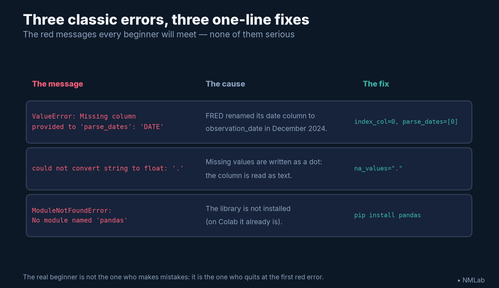
Three red messages, three one-line fixes: keep this table within reach, it covers most of what will stop you.
Key takeaways
- Why code — Against the "Reinhart-Rogoff": an opaque spreadsheet propagated an error all the way into global policy. A script is reproducible, versionable, re-runnable — and it scales (a hundred charts instead of one).
- Start without installing anything — Google Colab: Python, pandas and matplotlib ready in the browser, for free. A Google account is enough.
- The minimal script —
import pandas as pd; build the URL with the FRED identifier (e.g.GDPC1);pd.read_csv(url, …)downloads and reads in one line;.plot()draws. Eight lines, one chart.- THE trap — FRED's date column is called
observation_date(no longerDATE) since December 2024. Old tutorials crash. Robust:index_col=0, parse_dates=[0](by position, not by name).- Transform —
df.pct_change(4)*100turns a quarterly GDP into annual growth, in one instruction. Code applies the same operation to a hundred series at once.- Errors are your friends —
ValueError(wrong column name), "." values (addna_values="."),ModuleNotFoundError(pip install). All fixed in one line.
The journey ahead
Here you are, equipped: you know how to read a country's wealth, break it down, fetch the figures at the source and make them speak through code. Only one thing is missing — the most important for placing your money. For all this knowledge, however solid, is not enough to beat the market: the market has read the same data as you. The module's final chapter, its synthesis, draws that paradoxical and liberating lesson: "Growth Already Anticipated: Why It's Often Already in the Price." Until then, an exercise: take the minimal script, replace GDPC1 with CPIAUCSL, add .pct_change(12)*100, and you will plot U.S. inflation yourself. You have just written, in ten lines, the tool that very well-paid economists open every morning.
Sources and references
- Carmen M. Reinhart & Kenneth S. Rogoff, "Growth in a Time of Debt", American Economic Review 100(2), Papers & Proceedings, May 2010 — the 90% debt/GDP threshold and the −0.1% contraction.
- Thomas Herndon, Michael Ash & Robert Pollin, "Does high public debt consistently stifle economic growth? A critique of Reinhart and Rogoff", PERI Working Paper 322 (April 15, 2013), published in the Cambridge Journal of Economics 38(2), 2014 — three distinct problems: a spreadsheet error (rows 30–44 rather than 30–49, omitting Australia, Austria, Belgium, Canada, and Denmark), selective exclusion of available years, and unconventional weighting. Their combined correction raises the mean from −0.1% to +2.2%; the Excel error does not produce that full gap on its own.
- Wes McKinney — creation of the pandas library in 2008 at AQR Capital Management, open-sourced in late 2009 (pandas 0.1 on PyPI, December 25, 2009); pandas = panel data + Python data analysis. Book: Python for Data Analysis (O'Reilly, 1st ed. 2012).
- FRED CSV endpoint:
https://fred.stlouisfed.org/graph/fredgraph.csv?id=XXXX. The date-column header isobservation_datesince December 2024 (previouslyDATE) — hence the value ofindex_col=0, parse_dates=[0]. - Tools: pandas and matplotlib (Python libraries); pandas-datareader (direct FRED access); Google Colab (
colab.research.google.com, Python/pandas/matplotlib preinstalled); uv (fast local install). Minimal script tested under Python 3.11 / pandas 3.0. - Figure data: BEA and NBER via FRED — real GDP (GDPC1), recession indicator (USREC); year-over-year growth and recession bars computed by the script; Reinhart-Rogoff correction after Herndon, Ash & Pollin (2013) — vintage of July 16, 2026. Each figure comes with a Google Colab notebook (nmlab-figures repository) that rebuilds it (today's data for the charts, an editable diagram for the others).