18. Data Workshop: Discovering FRED, the Federal Reserve's Warehouse
· Updated on · 14 min read
On April 18, 1991, the Federal Reserve Bank of St. Louis put online a service that looked like nothing much: a dial-up bulletin board, reachable by modem, where you could download economic data for free. Thirty series. Six hundred and twenty users, capped at one hour a day, at the dizzying speed of 14.4 kilobits per second. That bulletin board had a name: FRED, for Federal Reserve Economic Data. It was, quite literally, the bank's first online presence — before the web was even truly worldwide.
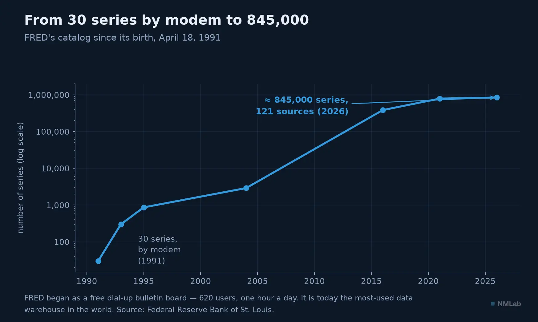
Thirty-five years later, FRED hosts about 845,000 series from 121 sources. The little dial-up server became the most-used economic data warehouse in the world.

For seventeen chapters, we have talked about dozens of figures: real GDP, the saving rate, the output gap, inflation, the temperature anomaly. None of them lives in a textbook; they live in databases you can consult, for free, in a few clicks. This chapter is a workshop: it teaches you to use FRED, the tool every investor, journalist and economist opens every day. By the end, you will no longer read the macro figures in the newspapers — you will go and fetch them yourself, at the source.
A word of caution before we begin, because stories circulate: FRED was not created by the person who leads it today. It was launched in 1991 by the St. Louis bank, whose tradition of disseminating data goes back to its 1960s research director, Homer Jones. Do not confuse the history of a tool with the face of its current team — already a first lesson in rigor.
At a glance — Hands-on workshop · Level: Intermediate · Prerequisites: chapter 6
By the end of this workshop, you will be able to:
- search, read and transform an economic series on FRED, then export it;
- recognise the six classic traps — including a seasonally adjusted series mistaken for a raw one;
- retrieve a number as it was published at the time, not as it has since become.
No technical prerequisite: everything is done with a mouse, in a browser.
A series page, dissected
Go to fred.stlouisfed.org and type, in the search bar, the name of a variable — "real GDP," for instance. FRED offers you series GDPC1, real GDP. Click, and there you are on a series page. Learn to read it, for it holds everything you need to know before you trust a figure. Under the title, a handful of fields: Observations, the latest available date and its value (the most recent point); Units, the most important field and the most treacherous — for GDPC1 it reads "billions of chained 2017 dollars, seasonally adjusted, at an annual rate," and every word counts. Then come Frequency, the rhythm (quarterly, monthly, daily), Source, who produces the data (here the BEA), Release, the publication it comes from, and two dates that say whether the series is still alive: Updated, when it was last refreshed, and Next Release Date, when the next figure drops. A detail many miss: there is no separate "seasonal adjustment" field — that information is baked into the Units line. Always read the units in full; they tell you whether you're looking at a level or a rate, real or nominal, seasonally adjusted or raw.
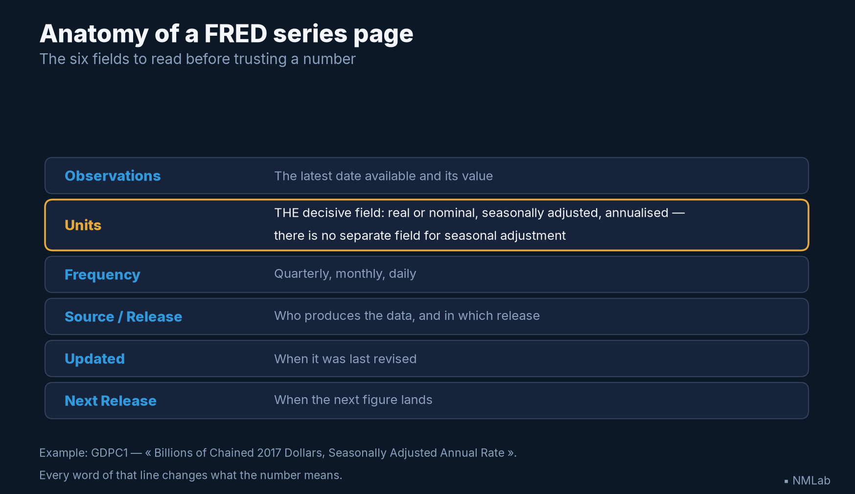
Six fields, and only one decides what the number means. The Units line is the one people skip — and the one that traps them.
The button that changes everything
Above the chart sits a button: "EDIT GRAPH". This is where FRED stops being a library and becomes a workshop, and it opens three powers. The first, EDIT LINE, lets you transform the series — we're getting to it. The second, ADD LINE, lets you overlay another: real GDP and potential GDP on the same chart, unemployment and inflation, as we did throughout this module. The third, FORMAT, sets the look — chart type (line, area, bars), log scale, colors — and above all a little box worth its weight in gold: "recession bars".
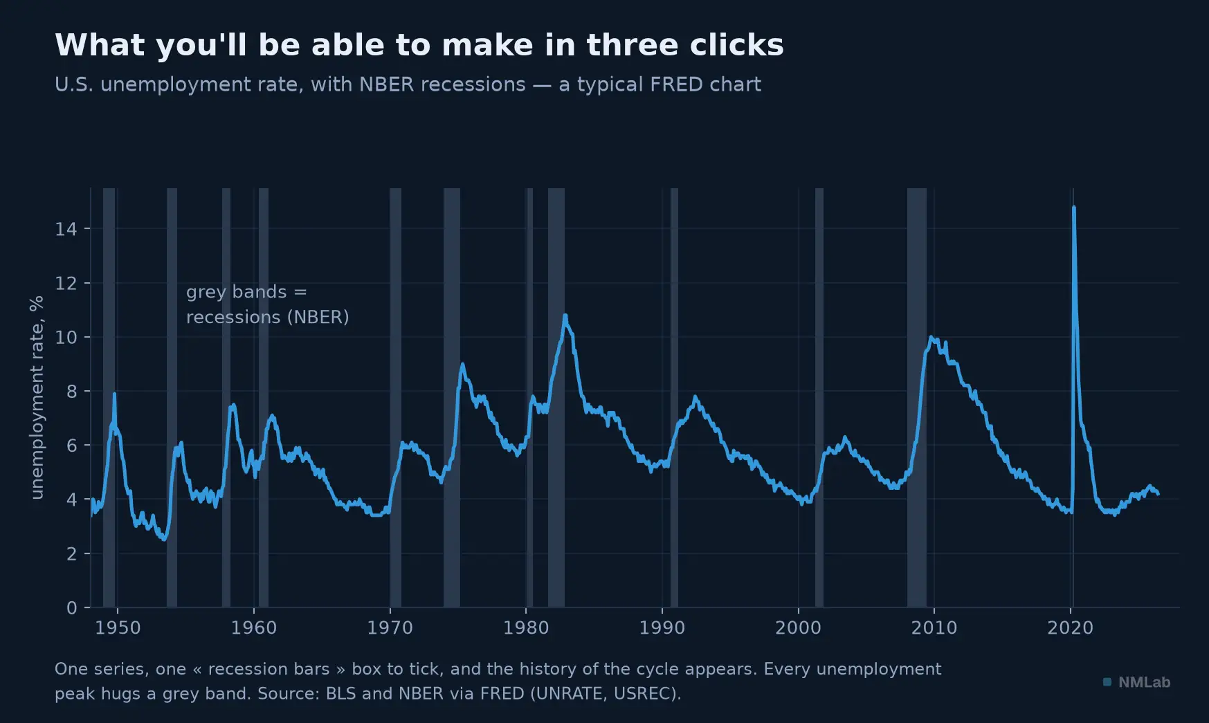
Tick "recession bars," and FRED shades in grey every recession dated by the NBER. In an instant, the history of the cycle appears: every unemployment peak hugs a grey band.
These grey bands deserve a pause, for they tell the economy's story better than a long speech. FRED anchors them on the official cycle dates set by the NBER — the committee that, in the United States, decrees after the fact the start and end of recessions. Overlay them on any series and you'll see at a glance how that variable behaves in crises: it is one of the most useful reflexes you can pick up. And when your chart is ready, the "DOWNLOAD" button exports it — as Excel, CSV, a PNG image, or a PowerPoint slide. (Don't look for PDF: it isn't there.) The data is yours; you can rework it, cite it, republish it.
The magic of transformations
Here is the power most beginners overlook, and which separates those who endure figures from those who interrogate them. In EDIT LINE, a Units dropdown offers a dozen transformations, applied in one click to any series. The same data tells radically different stories there.
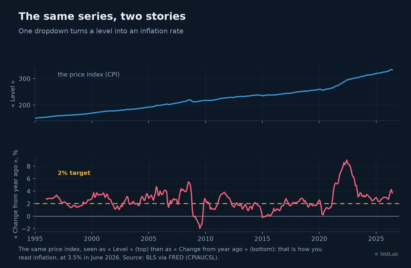
The price index (CPI) as a "Level" (top) says almost nothing to the eye: it goes up, always. As "Change from year ago" (bottom), the same figure becomes inflation — 3.7% in June 2026 — and tells the story of prices, 2022 peak included.
Take the consumer price index, CPIAUCSL. As "Levels," it is an endlessly climbing curve, unreadable. But choose "Percent Change from Year Ago," and that same series becomes the inflation rate — the one you read in the papers, at 3.7% in June 2026, with its peak near 9% in 2022. A dropdown turned an opaque level into the most-watched variable in macroeconomics. The menu offers many other options — absolute change, annualized rate, natural log, or the "Index" that resets a series to 100 at a chosen date to compare trajectories (like our two indexed economies from chapter 12). You can even write your own formula — a/b*100 for a ratio between two series. Explore this menu: it is the difference between looking at data and making it speak.
A concrete example, revisiting chapter 10. Search for nominal GDP, GDP, and display it; then, with ADD LINE, add real GDP, GDPC1. The two curves diverge, but their levels aren't comparable as they are. Now switch each to "Index (base 100)" at the same starting date — say the year 2000 — and the magic works: both start from the same point, and the gap that opens between them is cumulative inflation, the share of nominal growth that is nothing but a price illusion. In three transformations, you have rebuilt, with a mouse, the single most important distinction of the whole module. That is holding FRED in your hands.
From the tool to the question
A warehouse of 845,000 series is worth only as much as the question you put to it — and a good macro question always breaks down into four decisions. Take one of permanent relevance: is core inflation really slowing?
Which series? Not CPIAUCSL, the headline index, but CPILFESL, CPI excluding food and energy — the underlying trend of chapter 5 — and its cousin PCEPILFE, the measure the Fed actually targets. Two series for one question: the second acts as a control.
Which transformation? The year-on-year change is stable but slow: for twelve months it drags the memory of past increases behind it. The annualized rate of the latest month sees the turn far sooner, at the price of considerable noise. Rather than choosing, overlay them: when the second curve moves durably below the first, the trend has turned.
How much hindsight? The reflex of chapter 6 applies unchanged — one month is noise, three the beginning of a signal, six a trend. FRED computes no moving average in one click: that is one of the reasons to move to code, in the next chapter.
Which blind spot? The one the chart never shows. FRED plots breaks in definition without flagging them: the M1SL series displays a vertical step in May 2020, from 4,900 to 16,300 billion dollars — not because money tripled, but because a rule moved savings accounts from one box to another. Nothing on the curve warns you; only the source note does. Faced with any spectacular break, the first hypothesis is not economic, it is statistical.
A starter kit, and the traps to know
So as not to drown in 845,000 series, here are the codes to bookmark — the macro-watcher's survival kit: GDPC1 (real GDP), CPIAUCSL (price index), UNRATE (unemployment), PAYEMS (nonfarm payroll employment), FEDFUNDS (the Fed's policy rate), DGS10 (the ten-year yield), and USREC (the NBER recession indicator). With those seven, you already track the essentials of an economy.
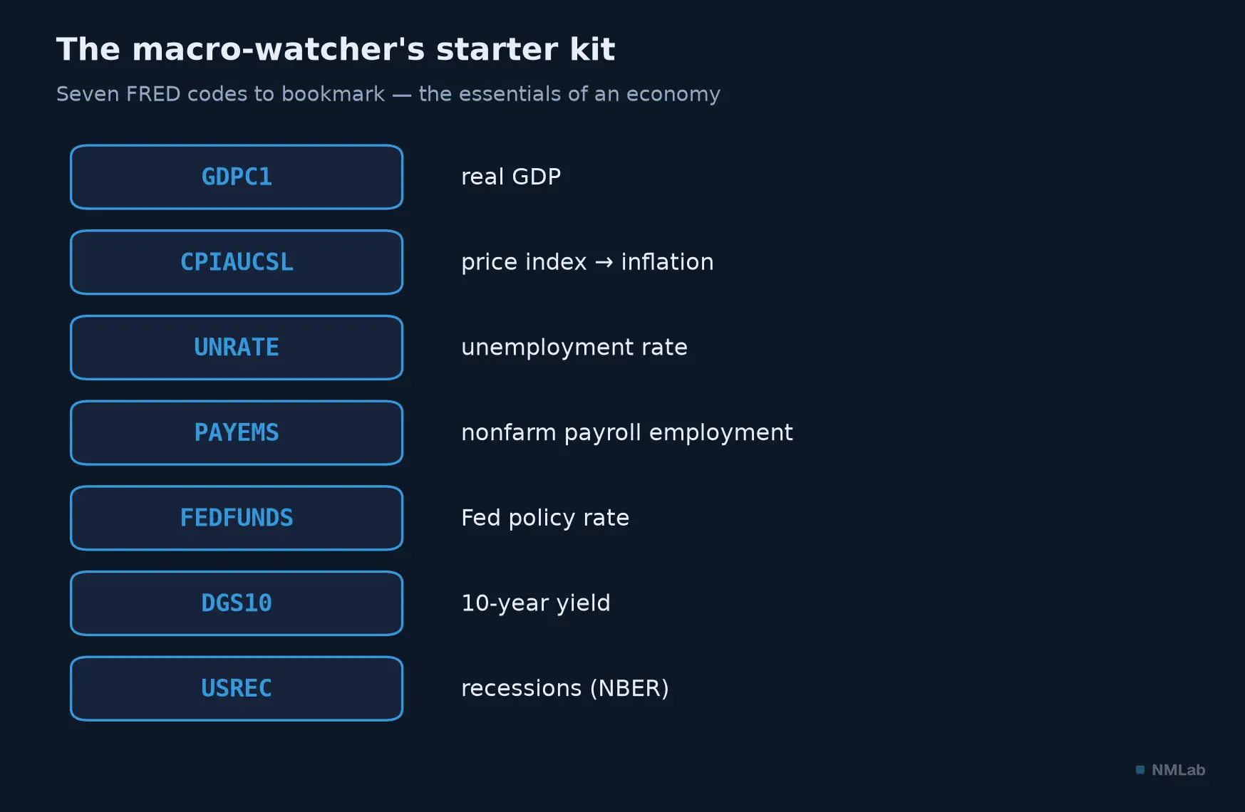
Seven codes are enough to take the pulse of an economy: output, prices, employment, rates and the cycle.
But a good tool is judged by knowing its traps, and there are six, learned the hard way by generations of users. The first is seasonal adjustment: the series CPIAUCSL is seasonally adjusted (SA), its twin CPIAUCNS is not (NSA); they differ by two letters, and yet the SA version is for reading month-on-month changes, the NSA for twelve-month changes — take the wrong one, and your analysis derails.
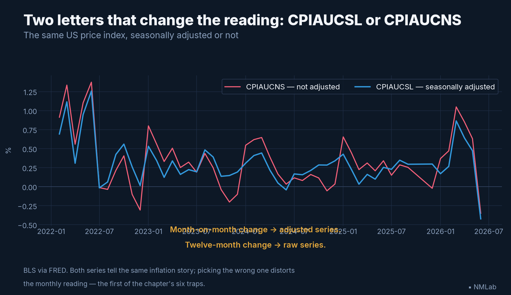
Two letters apart, two very different curves: the raw series swings with the seasons, the adjusted one erases them. The choice of series makes the reading.
The second trap is misleading units: "billions of chained 2017 dollars, at an annual rate" is not plain "billions of dollars" — the first is real GDP, the second nominal (remember chapter 10) — and "annual rate" means a quarterly figure is scaled as if it lasted a year. The third lurks in projection series in disguise: some, like potential GDP GDPPOT, extend to 2036, and their "latest observation" is not data but a forecast (the CBO's, as in chapter 15) — never mistake it for an observed fact.
The other three traps concern the life of the data. GDP and employment are revised, sometimes heavily, and FRED shows only the latest version; to recover a figure "as it was published at a past date," there is a twin of FRED, ALFRED (Archival FRED), which keeps every vintage — the indispensable tool if you want, as in chapter 15, to grasp how much an estimate has moved. Some series, next, are marked "DISCONTINUED" in their title: they are no longer updated, because a source changed method or an agency dropped a product, and the curve stops dead — before relying on a series, always glance at the Updated field and Next Release Date, which tell you whether the data is still alive. Finally, publication lag: not all series are current at the same time — in mid-2026, GDP is at the first quarter while the price index and employment are already at June and consumption at May —, so comparing two series without checking they cover the same period is a beginner's error.
A whole ecosystem, and cousins for the rest of the world
FRED is not alone. ALFRED, as we said, archives vintages; FRASER digitizes American economic and financial history — speeches, reports, archives. Carry FRED in your pocket with the mobile app, or into your spreadsheets with the Excel add-in (Windows and Mac); and if you code, a free API is waiting for you — the subject of the next chapter. Don't look for GeoFRED: the old mapping service closed on September 1, 2022, and mapping is now built directly into the geographic series pages.
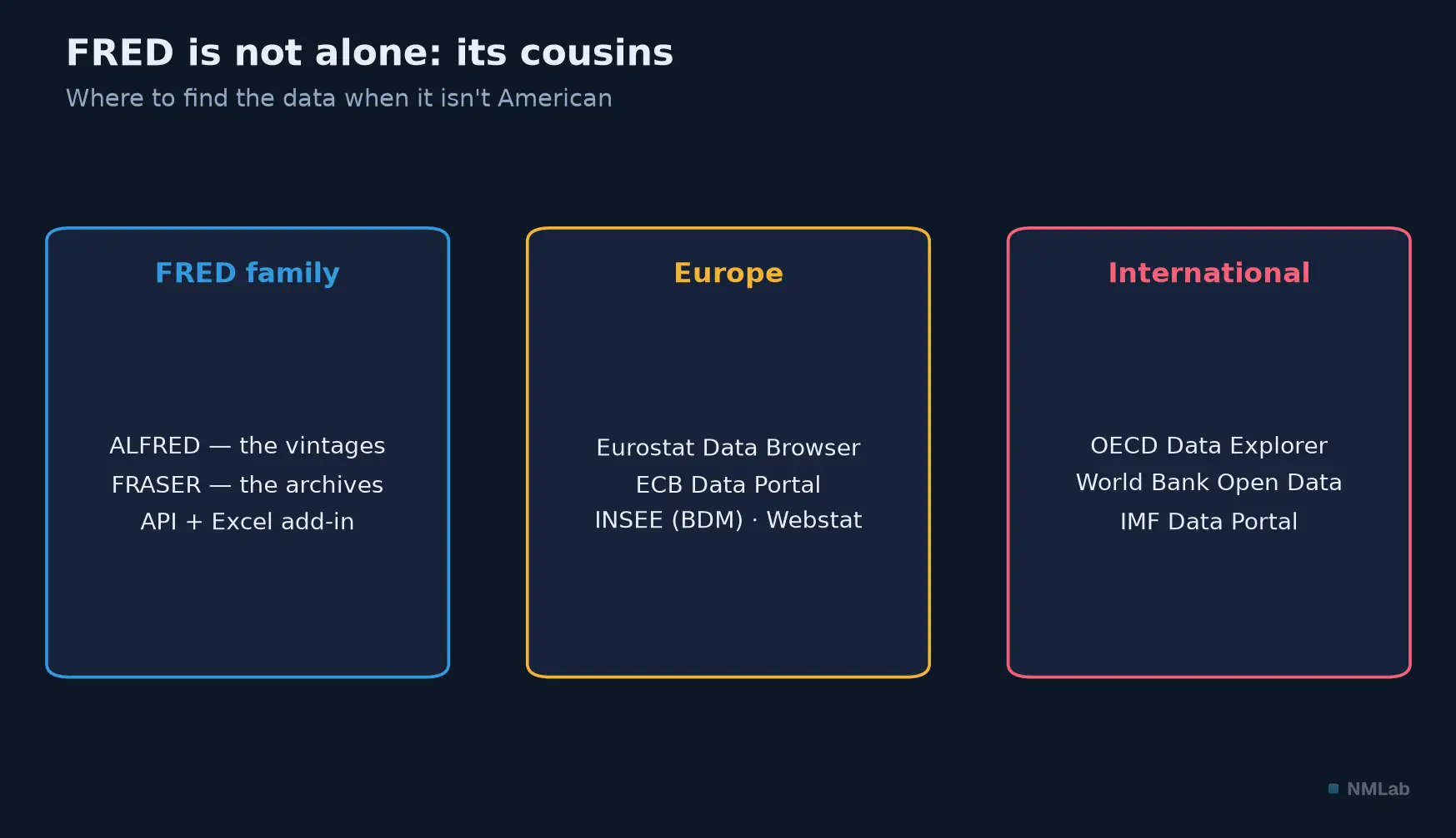
When the data isn't American, every major institution has its own warehouse: the logic stays the same, only the interface changes.
And if your data is not American? Every major institution has its FRED. In Europe, you will knock on two doors: the Eurostat Data Browser and the ECB Data Portal, which took over from the old SDW at the end of 2023. In France, INSEE keeps its BDM, the Banque de France its Webstat. At the OECD, the OECD Data Explorer replaced OECD.Stat in July 2024. Not forgetting World Bank Open Data and the IMF Data Portal. The interfaces change, the logic stays the same: find a series, read its units, transform it, export it.
A last word on data culture, because two quotations circulate in this world. The first is authentic and worth pondering: in 2009, as Google's chief economist, Hal Varian told the McKinsey Quarterly: "I keep saying the sexy job in the next ten years will be statisticians. People think I'm joking — but who would've guessed that computer engineers would've been the sexy job of the 1990s?" The second, "In God we trust; all others must bring data," is delicious — but it is misattributed to W. Edwards Deming, the great quality theorist. There is no evidence he said it; it is an anonymous adage. Checking your sources, even for a quotation: that, at bottom, is the whole spirit of FRED.
Key takeaways
- What FRED is — The St. Louis Fed's database, born April 18, 1991 as a dial-up server (30 series); today ≈ 845,000 series, 121 sources, free and no account needed to browse. The most used in the world.
- Reading a series page — Key fields: Observations (latest point), Units (the most important: real/nominal, seasonally adjusted, annualized — no separate seasonal-adjustment field), Frequency, Source, Updated, Next Release.
- EDIT GRAPH — Three powers: EDIT LINE (transform), ADD LINE (overlay), FORMAT (including the "recession bars" box, the NBER recessions). Export as Excel, CSV, PNG, PowerPoint.
- Transformations — The Units menu changes everything in one click: "Level," "Change from year ago" (= inflation for the CPI), annualized rate, log, "Index" (base 100). Or your own formula (
a/b*100).- The starter kit —
GDPC1,CPIAUCSL,UNRATE,PAYEMS,FEDFUNDS,DGS10,USREC.- The traps — SA vs NSA (CPIAUCSL / CPIAUCNS); units (real vs nominal, annualized); projection series (GDPPOT runs to 2036); revisions (use ALFRED for vintages); discontinued series; publication lag.
- The ecosystem — ALFRED (vintages), FRASER (archives), API, Excel add-in; and the regional cousins: Eurostat, ECB Portal, INSEE/Webstat, OECD Data Explorer, World Bank, IMF.
The journey ahead
You now know how to navigate FRED with a mouse — search, transform, export, in a few clicks. But imagine you wanted to draw not one chart, but a hundred; to recompute an inflation rate every morning; to cross ten series at once. The mouse quickly hits its limits. That is where the professional's tool comes in: a few lines of code. The next chapter, a second workshop, will have you write your first Python script: load a FRED series and plot it, in ten lines, with nothing complicated to install. Three minutes of practice in the meantime: go to FRED, open the UNRATE series, tick the recession bars, switch it to "Change from year ago," and download the result as CSV. You have just done, in three minutes, what once took an entire library.
Sources and references
- Federal Reserve Bank of St. Louis — FRED history: launched April 18, 1991 as a dial-up bulletin board by modem (30 series, 620 users, one hour a day), the bank's first online presence; moved to the web in 1995; ≈ 845,000 series and 121 sources in 2026. ("The History of FRED," "FRED Database Marks 30th Anniversary.") The data-dissemination legacy goes back to Homer Jones (research director, 1960s).
- FRED (
fred.stlouisfed.org) — series pages (Units, Frequency, Source, Release, Updated); the EDIT GRAPH button (EDIT LINE, ADD LINE, FORMAT); recession bars based on NBER dates; the Units transformation menu (Levels, Change, Change from Year Ago, Percent Change, Percent Change from Year Ago, Compounded Annual Rate, Continuously Compounded, Natural Log) and the "Index" option; export as Excel/CSV/PNG/PowerPoint. - Series cited: GDPC1 (real GDP), CPIAUCSL / CPIAUCNS (SA / NSA CPI), UNRATE (unemployment), PAYEMS (nonfarm payrolls), FEDFUNDS (policy rate), DGS10 (10-year yield), USREC (NBER recession indicator), GDPPOT (potential GDP, CBO, projected to 2036).
- Ecosystem: ALFRED (vintage / real-time data), FRASER (historical library), FRED API (free key), Excel add-in (Windows and Mac). GeoFRED closed September 1, 2022 (mapping now integrated). Regional portals: Eurostat Data Browser; ECB Data Portal (replaces the SDW, end Sept. 2023); INSEE BDM and Webstat (Banque de France); OECD Data Explorer (replaces OECD.Stat, July 1, 2024); World Bank Open Data; IMF Data Portal.
- Hal Varian, interview "Hal Varian on how the Web challenges managers," The McKinsey Quarterly, January 2009 — "the sexy job in the next ten years will be statisticians." The quotation "In God we trust; all others must bring data" is misattributed to W. Edwards Deming (an anonymous adage; classed "misattributed" by Wikiquote and Quote Investigator).
- Figure data: Federal Reserve Bank of St. Louis (catalog growth); BLS and NBER via FRED (UNRATE, USREC); BLS via FRED (CPIAUCSL) — vintage of July 16, 2026. Each figure comes with a Google Colab notebook (nmlab-figures repository) that rebuilds it (today's data for the charts, an editable diagram for the others).