6. Where Do Macro Numbers Come From? Sources, Frequency and Reliability
· Updated on · 18 min read
A mid-month morning, 8:29 a.m. in Washington: the trading floors fall silent, the algorithms are armed. At 8:30, the Bureau of Labor Statistics publishes last month's American inflation — a fraction of a second later, machines have read it, compared it with the consensus, and tens of billions of dollars have changed hands. Where does it come from, this number that holds the market's breath? From a statistical agency, where field agents and programs have, over weeks, collected tens of thousands of prices, aggregated, corrected and weighted them, then kept them under seal until the embargo. The most awaited number on the financial planet is not a reading of reality: it is a manufactured product — raw materials, lead times, factory defects, and an after-sales service called revisions.
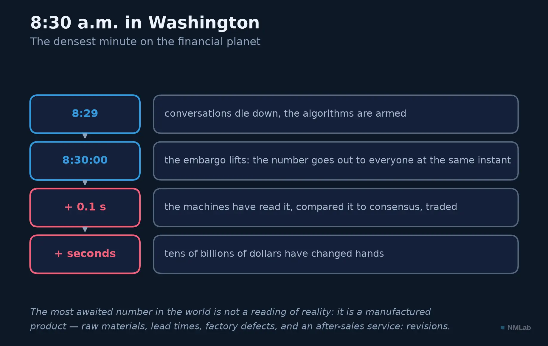
The release minute that paces this chapter.

This chapter answers five questions: who makes the macro numbers? out of what? at what rhythm? why do they change after the fact? and how far can they be trusted? The short answer: they are estimates — dated, sampled, revisable — produced by institutions whose independence is fragile, and delivered on a calendar so regular it paces the markets like a liturgy. Respecting them without worshipping them: that is the skill to install.
At a glance — Level: Intermediate · Prerequisites: chapter 5
By the end of this chapter, you will be able to:
- say who makes macro numbers, out of what, and why they are revised for years;
- read a margin of error — and see why the surprise markets celebrate is sometimes smaller than the fog of measurement;
- tell an imperfect but honest statistic from one under political influence.
Manufactured numbers, in the noble sense of the word
GDP does not exist in nature: no one has ever bumped into an unemployment rate in the street. These quantities are statistical constructs — conventions that define a concept (what is "producing"? "looking for work"?), then instruments that try to measure it. Between reality and the number sit human choices: what you count, what you ignore, how you ask and correct.
These constructs are recent: in the early 1930s, in the depths of the Great Depression, the American government was flying blind. Congress commissioned Simon Kuznets to build the first national income accounts; his 1934 report founded what would become GDP, and the war turned it into an instrument of state. At the same time, Richard Stone was building in Britain the international standard of national accounts; both won the Nobel. Yet as early as 1934, Kuznets warned Congress that a nation's welfare can hardly be inferred from national income: the father of GDP was the first to bound its meaning.
A consequence long left unsaid: a measure built on surveys and conventions carries a margin of error, as in physics — yet economic figures are traded to the decimal point. Oskar Morgenstern made a classic book of it, On the Accuracy of Economic Observations: no physicist would publish a constant without its uncertainty interval. A number is not accurate because it is official: it is usable — publicly defined, methodically produced, honestly corrected. Accuracy comes by successive approximations.
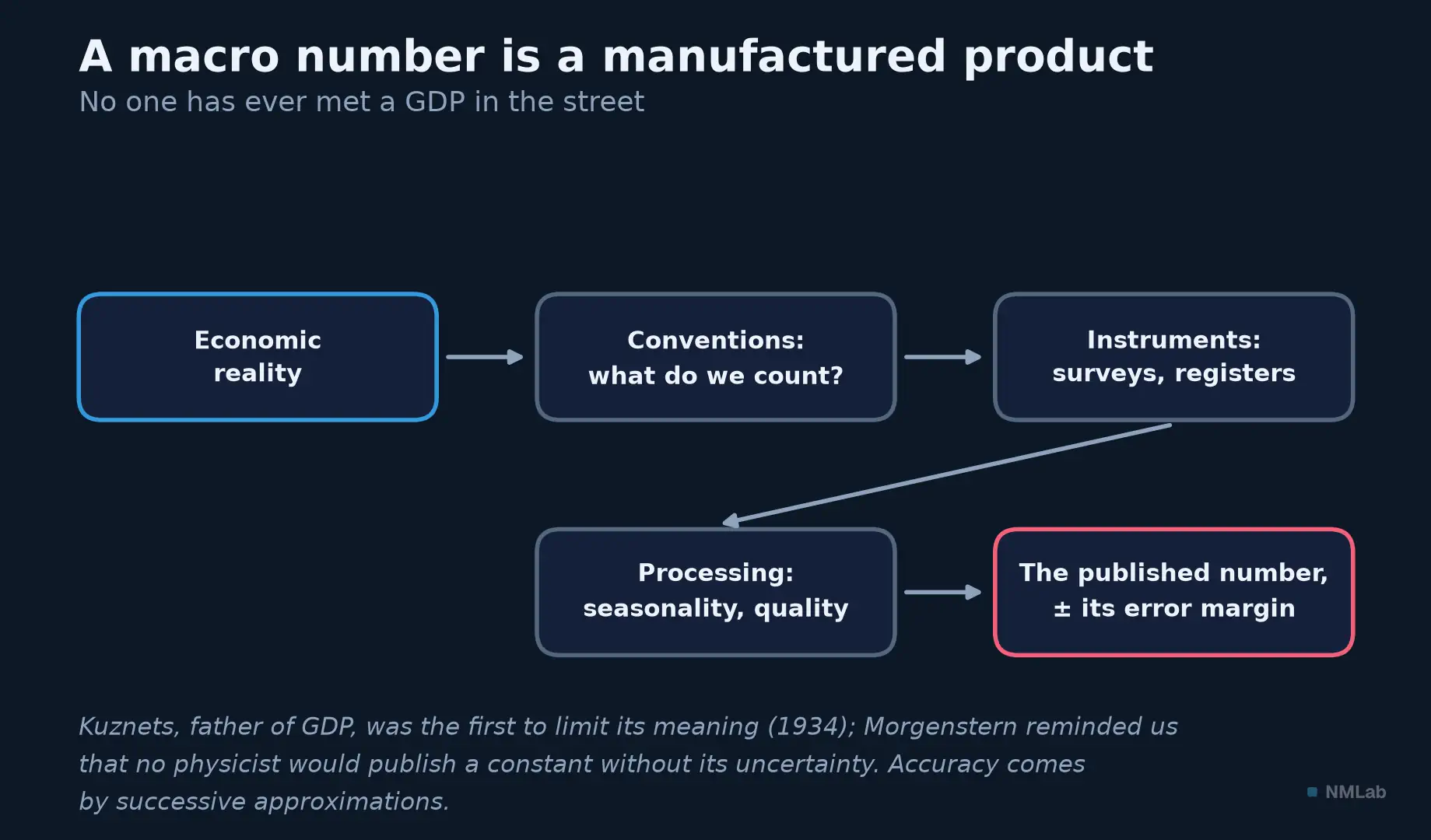
From reality to the number: conventions, instruments, processing — and an error margin straight off the production line.
Who makes what: the map of producers
Trace a number back to its source: you almost always land on a national institute — INSEE in France, Destatis in Germany, the ONS in the UK — with Eurostat heading the euro area. In the United States, the trail forks: the Bureau of Labor Statistics (BLS) produces employment and consumer prices, the Bureau of Economic Analysis (BEA) GDP and PCE inflation, the Census Bureau retail sales, housing and foreign trade. Three counters for a single dashboard.
The central banks, for their part, produce as much as they consume: the Federal Reserve publishes industrial production and the financial accounts, the ECB monetary and banking statistics. Above them, the international organizations — IMF, OECD, World Bank, BIS — collect little but compare countries and set standards. That leaves the private producers, the underrated family: the ISM has polled purchasing managers since the 1930s, S&P Global publishes its PMIs in dozens of countries, the Conference Board and the University of Michigan (since 1946) survey household morale. These surveys do not measure activity but answers — a judgment, an intention. It is the divide already met in the panorama: soft data (opinion, early and swayed by mood) versus hard data (realized activity, late and reliable). The investor uses both, always knowing which one they are reading.
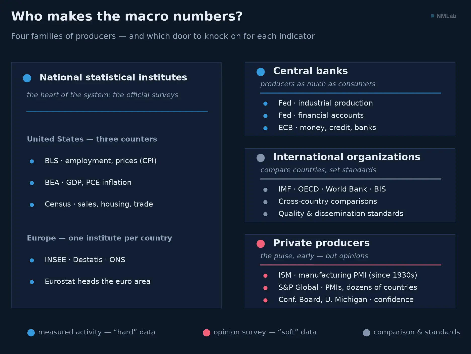
The four families that feed the dashboard. Blue = realized activity ("hard"), red = opinion survey ("soft"), grey = comparison and standard-setting.
What holds it all together: statistical ethics. Since 1994, the UN fundamental principles have put it in writing as an obligation: public methods, calendars announced in advance, simultaneous access for all, political power held at arm's length. It is what lets a market trade an official number and a citizen hold power to account; we will see what happens when it gives way.
The recipe: giant surveys, registers and cash registers
Three raw materials complement one another. The first, the most fragile: the survey. American inflation rests on some 80,000 prices collected each month; the unemployment rate, on a poll of about 60,000 households (the household survey); job creation, on the establishment survey, which collects the payrolls of about 120,000 employers. The same jobs report thus contains two surveys of different scope, which can tell two stories in the same month — unemployment rising while hiring accelerates, or the reverse.
But a survey, even a giant one, is still a survey: to infer from 60,000 households the situation of 170 million workers is to extrapolate — hence to accept a margin of error. The BLS publishes it: the 90% confidence interval on monthly job creation is on the order of ± 130,000. Read that again: the gap the market celebrates — "180,000 jobs created instead of the 150,000 expected" — is smaller than the blur of the measurement. And everywhere, response rates are eroding (the American household survey's has slipped from over 90% toward 70% in fifteen years). Josiah Stamp (1929) quipped: at the end of the chain, someone writes down "whatever he damn pleases" in the form's box. An exaggeration — the institutes cross-check and adjust — but a fair one: a statistic is worth what its respondents are worth.
Second raw material, symmetrical: the administrative register — data produced not to measure, but to manage. Weekly jobless claims are the count of claims actually filed; customs record every container, the tax office sees wages and revenues go by. Nearly exhaustive sources — no sample, hardly any margin of error — but narrow: they see only what the administration handles, with its own definitions, often with a lag. Modern statistics therefore marries the two: the survey for speed, the register for accuracy — the latter re-anchoring the former once a year.
Third, the most recent: big data. Since 2020, INSEE has computed part of France's prices from supermarket scanner data — millions of real transactions rather than field agents' readings. Alberto Cavallo and Roberto Rigobon (MIT) had blazed the trail back in 2008 with the Billion Prices Project, which scraped online-store prices every night — and exposed the manipulation of Argentina's statistics by publishing a daily alternative inflation. Card payments, online job postings, satellite images: the toolkit widens each year, complementing surveys more than replacing them.
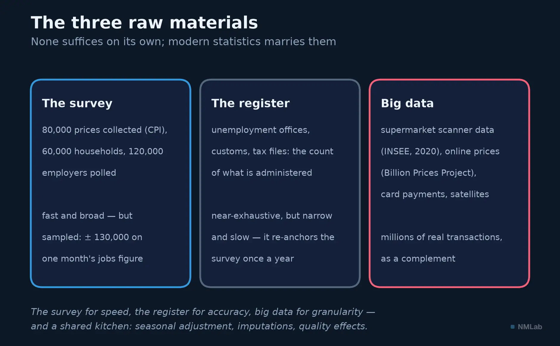
Three raw materials, three temperaments: the survey is fast, the register tells the truth, big data sees fine detail.
Then comes the cooking that makes the raw material publishable. Series are seasonally adjusted (by programs from the Census Bureau) so that December does not look like a retail boom; they are annualized; what is missing is imputed (a model estimates the firms born and dying within the month); prices are adjusted for quality effects — if the new phone costs 5% more but does twice as much, what share is inflation? Each treatment is reasonable, documented — and fallible when the world comes off its hinges. In April 2020, America destroyed more than twenty million jobs and unemployment leapt to 14.7% — but the BLS noted, in the release itself, that a classification error (temporary layoffs counted as "employed") should have pushed it five points higher, toward 20%. The admission, in real time, in the official document: the difference between an honest statistic and an exact one.
The calendar: the investor's typical month
Every major release has its day, its hour, its frequency, announced months ahead; the markets live to that rhythm. Here is the typical American month.
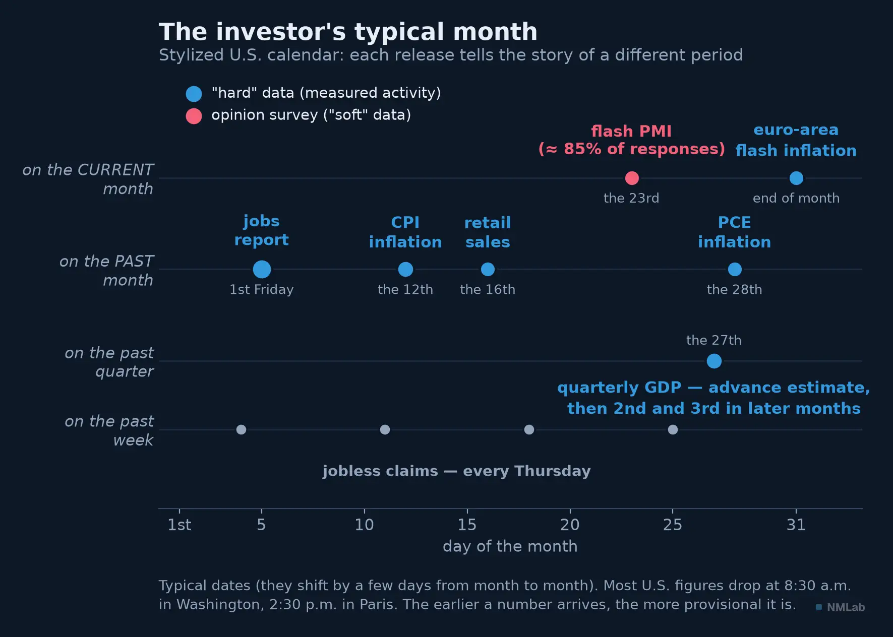
The investor's month: each dot's lane shows the period it tells. Surveys (red) always run ahead of realized data (blue).
Three cadences nest together. The weekly: every Thursday, jobless claims — the fastest pulse of the American economy. The monthly, your backbone: the ISM opens the ball on the first business day, the jobs report reigns on the first Friday, the CPI around the 12th, retail sales at mid-month, PCE inflation — the one the Fed targets — closes the month. The quarterly: GDP, a month after the quarter closes, then republished twice. Europe has its euro-area flash estimate on the very last day of the month it measures — the United States has no flash.
The hour matters as much as the day: most American figures drop at 8:30 a.m. in Washington (2:30 p.m. in Paris), under embargo — wires and official servers flip at the same instant, so no player trades before the others. A condition for the surprise — the gap to the consensus — to play its role as a pure shock. Surveys arrive before hard data: the flash PMI appears around the 23rd of the month it describes, on about 85% of responses — but it measures only a mood. At the other end, GDP says almost everything, almost definitively, three months too late for a trader. Hence the triangle no number resolves: early, rich, final — you get to pick two.
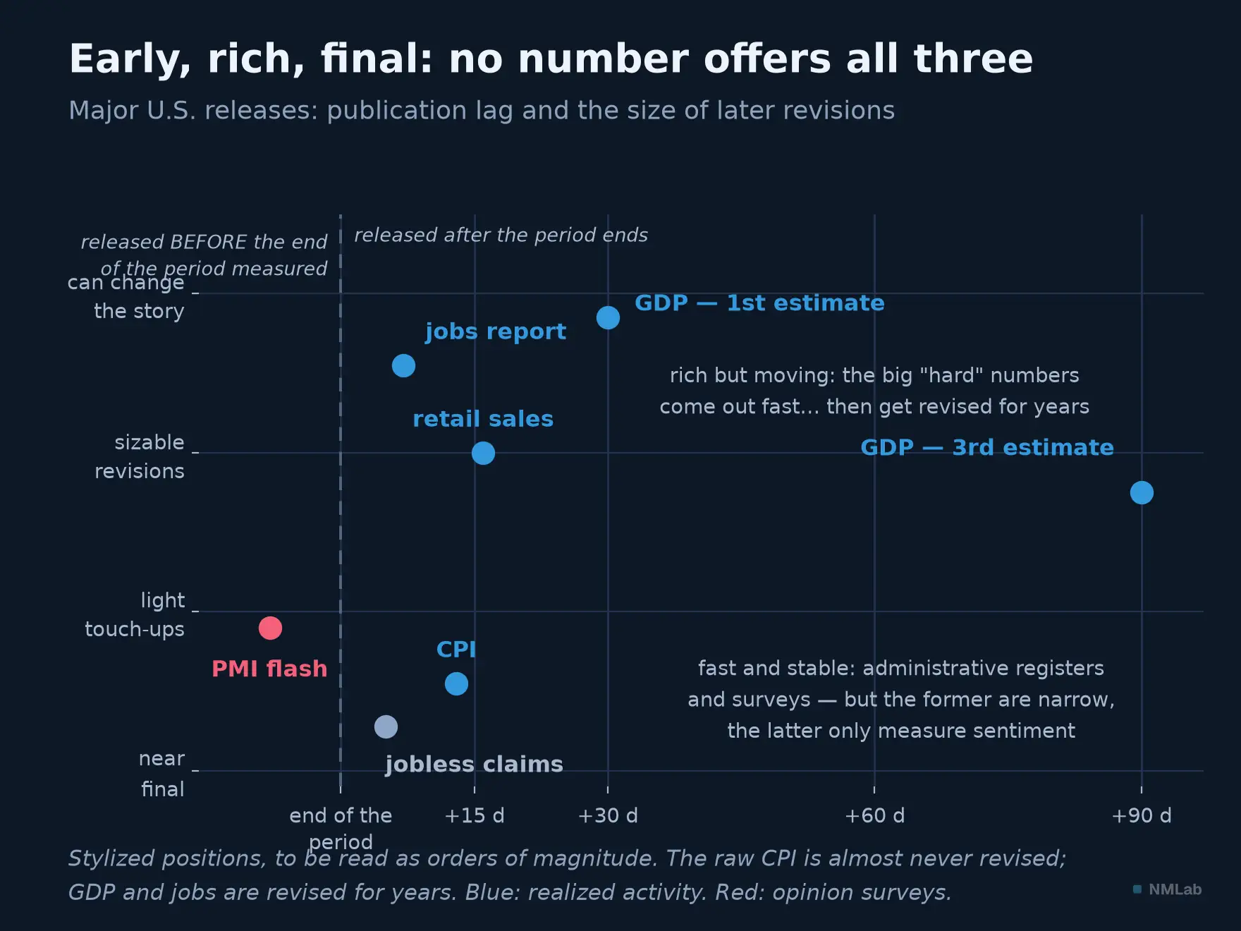
The impossible triangle: the fast and stable measures only a mood or a narrow scope; the big hard numbers come out fast then are revised for years. The exception: the CPI, out in twelve days and almost never retouched — hence the indexing of contracts to it.
The truth is provisional: in the realm of revisions
The most unsettling fact: the numbers change after they are published — not by error, but by construction. The first estimate combines the responses that arrived on time with assumptions to plug the gaps; then the latecomers reply, the slow sources (balance sheets, tax records, social registers) come in, the seasonal factors are recomputed, and the estimate is revised — once, twice, then in annual campaigns. American GDP appears in three passes — advance, second, third, a month apart — before being reopened every autumn for years. According to the BEA, the average revision between a quarter's first estimate and its value today reaches a good point of annualized growth — the very border between "the economy is accelerating" and "stalling."
Here, on vintage data, are the two quarters that, in the summer of 2022, put "recession" on the front page.
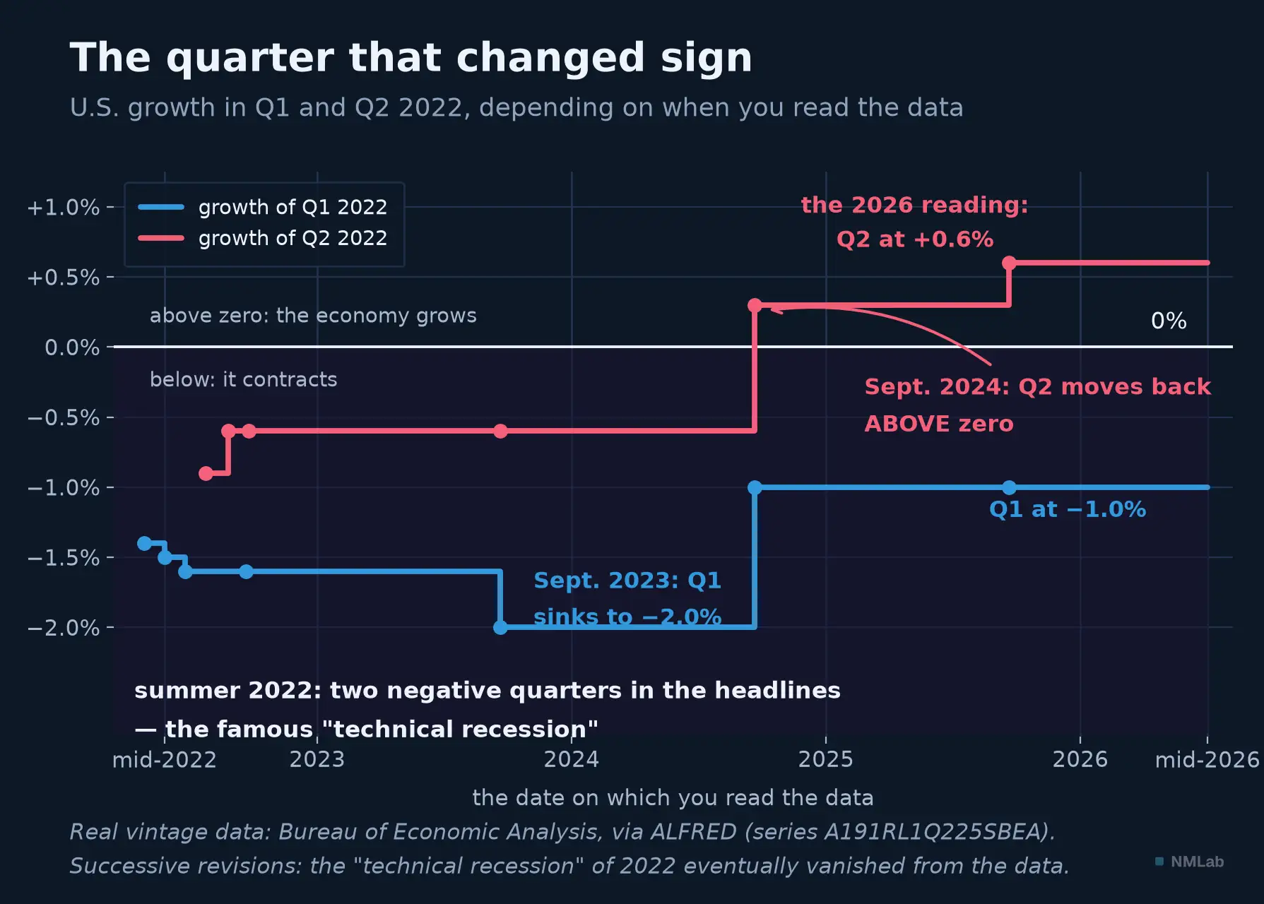
The same half-year, read four years apart. In the summer of 2022, two quarters of decline (−1.6% then −0.9% on first estimate): technical recession, worldwide debate. Revision after revision, Q2 turns positive in September 2024 and settles at +0.6% by 2026: the recession no longer exists. The NBER, for its part, had never declared one — employment was too strong.
That "phantom technical recession" was thus not only a matter of definition, but also of vintage: for months people argued over a fact that, a few revisions later, had ceased to exist. No one lied — each estimate was the best possible at the time. But economic history is written in pencil, and it takes years to go over it in ink.
Employment lives the same life: each monthly figure is revised over the next two months, then the whole survey is benchmarked once a year against the near-exhaustive unemployment-insurance registers. Brutally, at times: in August 2024, the BLS cut −818,000 jobs from the year ended March 2024 (the largest correction since 2009); in September 2025, the next exercise cut −911,000 more from the year to March 2025. Hundreds of thousands of jobs celebrated live on each first Friday never existed.
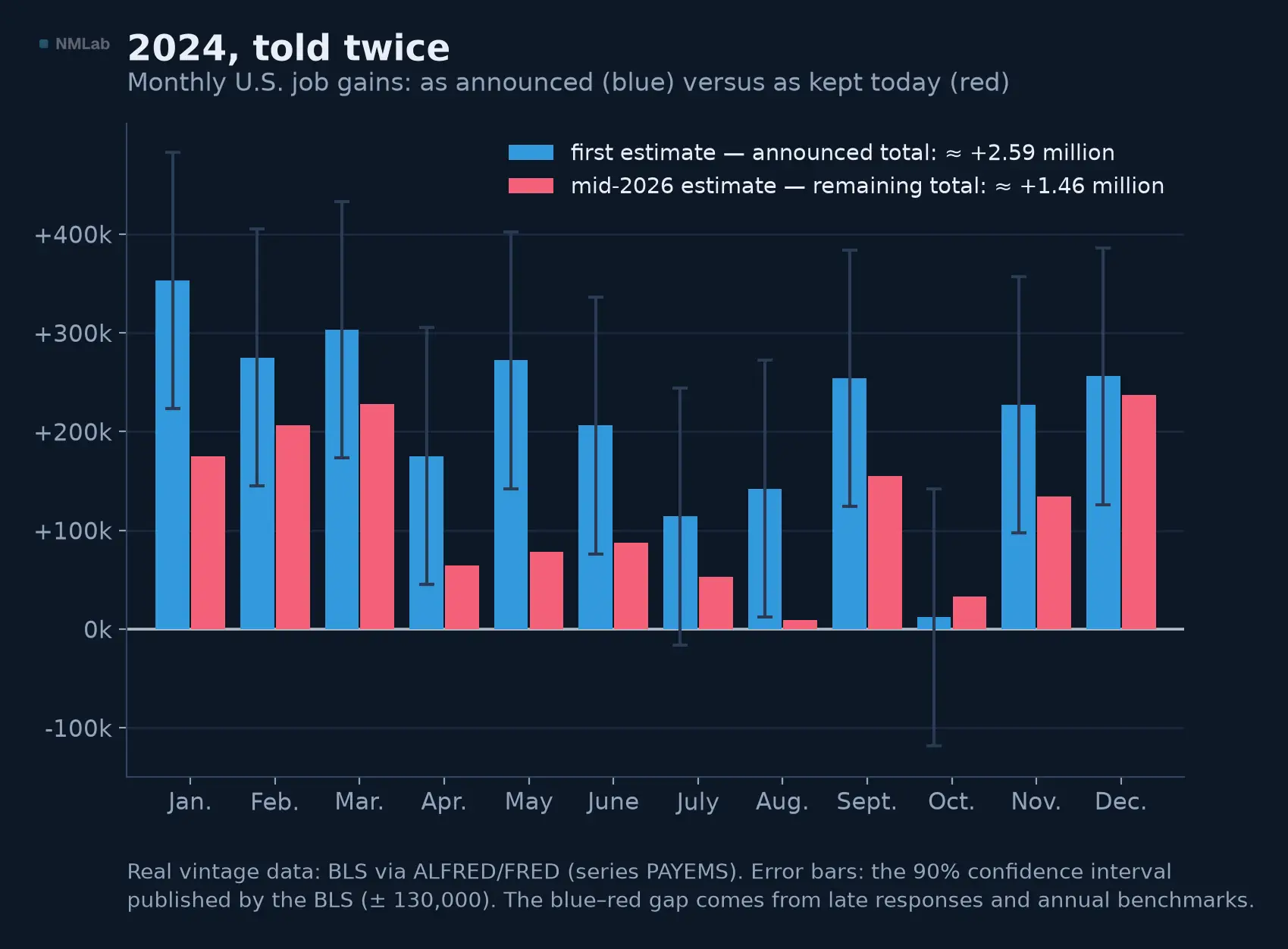
2024 as announced (blue) and as read today (red). ~2.6 million jobs announced month by month, 1.5 million left by mid-2026 — late responses and annual benchmarks. The BLS error bars, almost never cited: ± 130,000 a month.
The phenomenon is not American: in 2023, the British office discovered that the kingdom's economy, put at ~1% below its pre-pandemic level at the end of 2021, was in fact above it — two points of GDP at a stroke of the pen. Three lessons. Markets trade the first estimate: it carries the surprise, hence the move; being disproved later does not undo the session. Narratives built in real time rest on the provisional: a cluster of indicators is reliable where the isolated point is not. Finally, the gap between the just-closed quarter and its first GDP gave rise to nowcasting: the Atlanta Fed's GDPNow has, since 2014, tracked the current quarter — an estimate of an estimate.
One last trap, for quantitative readers: vintage in backtesting. Testing a strategy on today's data means using numbers no one knew at the time. This look-ahead bias flatters backtests. The remedy: vintage databases like ALFRED, the St. Louis Fed's archive, which keeps every past state of every series and supplied this chapter's figures. The reflex: use the data as they were, not as they have since become.
How far can they be trusted? Honest errors and numbers under influence
Everything above describes honest errors. But between good-faith imprecision and state lies stretches a continuum.
On the good-faith side, the measurement debates, permanent and public. In 1996, the Boskin Commission concluded that the American CPI overstated inflation by about 1.1 points a year (substitution, quality and new-product biases), prompting reforms that weighed on everything the CPI indexes, from pensions to tax brackets. Another example: housing makes up nearly a third of the American CPI, and its method brings rents into the index with a year's lag — in 2021-2023, official shelter inflation kept accelerating long after market rents had slowed, the Fed steering by a lagging thermometer. Even accounting identities waver: gross domestic income, meant to equal GDP, drifted noticeably from it in 2022-2023. Add Goodhart's law (1975): when a measure becomes a target, it ceases to be a good measure.
On the bad-faith side, three graded cases. Greece first: in the spring of 2009, Athens notified Brussels of a deficit forecast at about 3.7% of GDP; by autumn, the new government revealed more like 12.7%; after Eurostat inquiries, the story stopped at 15.4%. Not a revision, but a long-running cosmetic job — the spark of the euro-area crisis; since 2010, Eurostat has had real audit powers over national accounts. Argentina next: from 2007, the government brought its institute to heel to understate inflation and fined private economists who published their own measures; in February 2013 it earned a motion of censure from the IMF — the first in its history for false data, lifted only at the end of 2016. Fraud has a price: a country whose numbers lie borrows more dearly, for doubt is a risk premium. China last: in 2007, the future premier Li Keqiang told the American ambassador, per a WikiLeaks cable, that his province's GDP was "man-made" and that he preferred three series hard to fake — electricity, rail freight, bank lending. When the official thermometer is suspect, you cross-check with physical quantities no one thinks to rig.
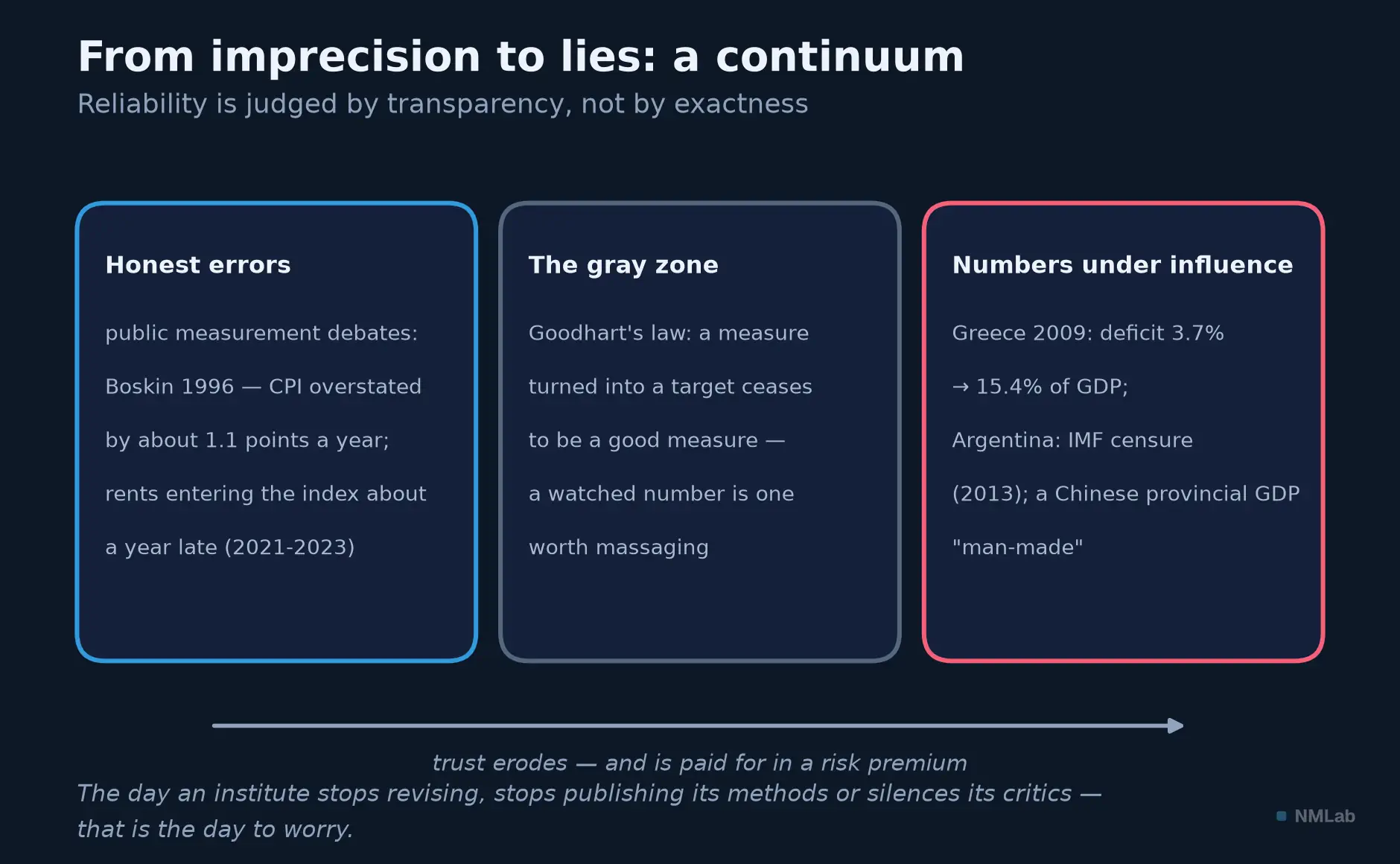
Good-faith imprecision is debated in public; window-dressing is paid for in a risk premium. Between the two, Goodhart's law keeps watch.
Statistical independence recently reminded the world's leading power of its worth. In the summer of 2025, a disappointing jobs report, laden with sharp downward revisions, was followed that same day by the firing of the BLS commissioner by the American president, who accused her without evidence of rigging the numbers; in the autumn, a record budget standoff suspended federal releases for weeks — markets and central bank in the fog, some October observations lost for good. The lesson: the credibility of a nation's statistics is public infrastructure, like a power grid — invisible while it works, ruinously expensive to rebuild.
Hence the verdict. The numbers of the great statistical democracies are reliable — not because they are exact, but because their flaws are public: documented methods, published margins of error, owned revisions, international dissemination standards (the IMF has kept one since 1996). Transparency about imperfection is what separates statistics from propaganda. The day an institute stops revising, no longer publishes its methods, or silences its critics is the day to worry.
The toolkit: finding the numbers, and reading them without being trapped
Where to find all this? For free, often better than the paid services. The universal gateway is FRED, the St. Louis Fed's database: hundreds of thousands of exportable series, and its sister ALFRED keeps the vintages; Eurostat, the ECB and INSEE offer the European equivalent. For the rhythm, an economic calendar gives you fair warning: date, time, consensus, previous value of each release. For method, every BLS or BEA release carries its technical notes and margins of error.
Six reflexes, extending those of the lexicon. One: identify what you are reading — level or change, raw or seasonally adjusted, year-on-year or annualized rate. Two: compare with the consensus, never with zero nor with the previous month alone — it is the surprise that moves markets. Three: respect the margin of error — a single figure is noise, three months' average a beginning of signal, six consistent months a trend. Four: the first estimate will be revised — do not build a firm conviction on a provisional number. Five: cross the soft and the hard — a survey that dives while realized data do not follow is a mood, not yet a fact. Six: in quantitative research, use the data of the time, not today's.
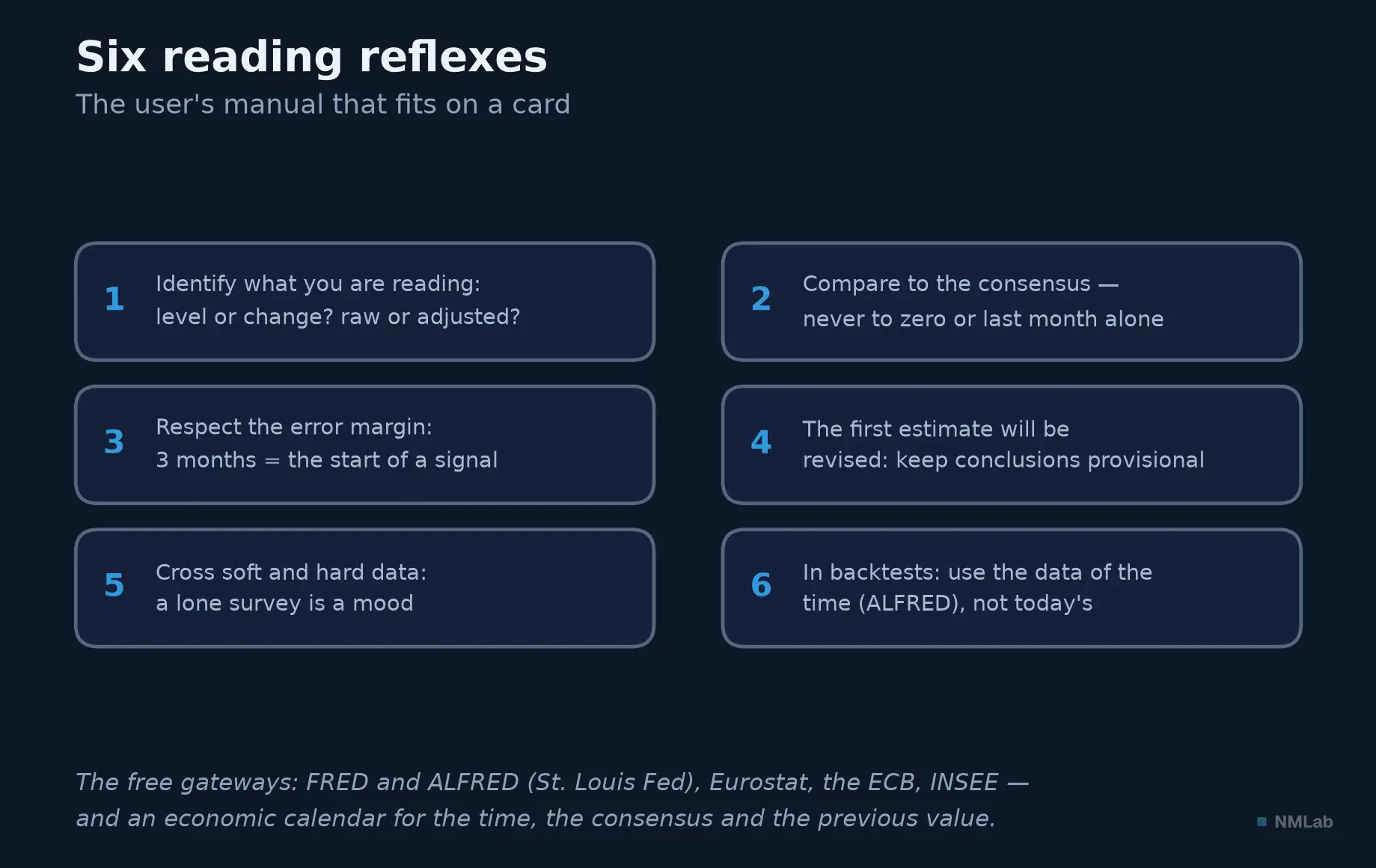
Six reflexes to keep by the screen — and free gateways to check everything yourself.
Key takeaway
- A manufactured estimate, not a fact of nature — GDP does not exist in nature: no one has ever bumped into an unemployment rate in the street. Sampled, corrected, seasonally adjusted: the number is a finished product.
- The factory, and its ritual — Giant surveys, registers, scanner data, then processing that is documented and fallible; delivered on a day and hour announced months ahead — a liturgy that paces the markets.
- The revisions — The first version moves markets: it carries the surprise against the consensus. The final version writes history; the two can differ utterly, like the American "recession" of 2022, gone from the data. Economic history is written in pencil, and it takes years to go over it in ink.
- The margin of error, published and ignored — ± 130,000 on a single month's job creation, sometimes wider than the surprise being celebrated. All the difference between an honest statistic and an exact one.
- Reliability is judged by transparency — Public methods, owned revisions, an independent institute. Treat each release as sworn testimony — precious, dated, fallible — never as a verdict.
The rest of the journey
This chapter closes the inventory of foundations: why macroeconomics steers your investments, at what scale it reasons, which variables populate its dashboard — and where its numbers come from. What remains is to make it a habit: that will be the subject of the next chapter, "Module 1 in practice: building a macro-watch routine." Until then, keep the rule of this chapter: behind every macro number, ask who made it, out of what, and whether it will be revised — and read the gap to the consensus before the number itself.
Sources and further reading
- Simon Kuznets, National Income, 1929-1932 (report to the U.S. Senate, 1934) — the birth certificate of American national accounting.
- Oskar Morgenstern, On the Accuracy of Economic Observations (Princeton University Press, 2nd ed. 1963).
- Josiah Stamp, Some Economic Factors in Modern Life (1929).
- Bureau of Labor Statistics, The Employment Situation — technical notes (household/establishment samples; 90% confidence interval of ± 130,000 in the 2024 notes, ± 122,000 in recent ones); the April 2020 release (8 May 2020) documenting the pandemic classification error (~5 points).
- Bureau of Labor Statistics, preliminary annual benchmark revisions to the establishment survey: −818,000 jobs (August 2024, year to March 2024), −911,000 (September 2025, year to March 2025).
- Dennis Fixler, Ryan Greenaway-McGrevy & Bruce Grimm, "The Revisions to GDP, GDI, and Their Major Components," Survey of Current Business (BEA, 2014) — the size of American GDP revisions.
- Boskin Commission, Toward a More Accurate Measure of the Cost of Living (1996) — the American CPI's overstatement of about 1.1 points a year.
- Charles Goodhart, "Problems of Monetary Management: The U.K. Experience" (1975).
- Eurostat, Report on Greek Government Deficit and Debt Statistics (January 2010) — the Greek falsifications; the 2009 deficit established at 15.4% of GDP.
- International Monetary Fund, censure of Argentina (February 2013, lifted November 2016) — the first IMF censure for false data.
- Alberto Cavallo & Roberto Rigobon, "The Billion Prices Project," Journal of Economic Perspectives (2016).
- The Economist, "Keqiang ker-ching" (December 2010) — the 2007 cable (WikiLeaks) on provincial GDP "made by man."
- Figure data: BEA (GDP, series A191RL1Q225SBEA) and BLS (employment, series PAYEMS), vintages via ALFRED/FRED, Federal Reserve Bank of St. Louis.