7. Module 1 in Practice: Building Your Macro Monitoring Routine
· Updated on · 18 min read
Two investors wake up on the same Monday. The first grabs his phone at 7:04: three alerts, a social feed announcing the imminent collapse of the dollar, a broker note about a "hawkish repricing," two economists tearing into each other over inflation. Forty minutes later he puts the device down, pulse a little higher, nothing usable in mind; tonight, he will do it again. The second runs, later in the morning, a fifteen-minute ritual: the day's release calendar, a handful of prices known by heart, the gap between the latest number and the expected one, one line in a logbook. Then he closes the tab and returns to his day. Both read the same numbers, published at the same times under the same embargo. A year on, the first will have "followed the markets"; the second will know where he stands — in a tenth of the time.
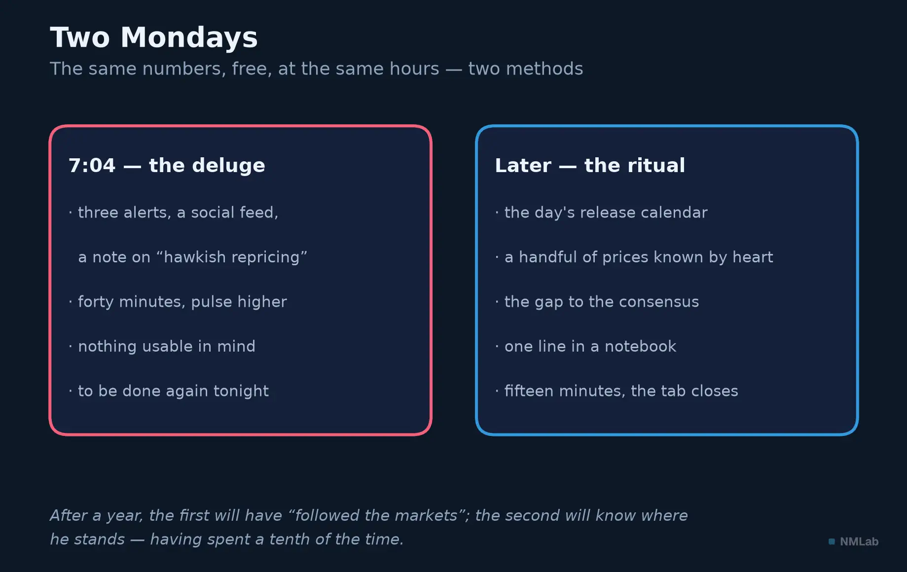
The same numbers, the same times, two methods: the deluge agitates, the ritual informs.

The difference is neither talent nor access to information: it is a monitoring routine — a small system decided in advance, which says what to watch, when, in what order, and above all what to ignore. That is the subject of this final hands-on chapter of the setting-out. The six before it laid down the knowledge: why the economy steers your investments, the fraction that ties the two together, the dashboard, the language, the making of the numbers. What remains is to install the practice — for knowledge without procedure does not survive contact with the news flow.
A famous objection blocks the road, though, in a line commonly attributed to Peter Lynch, Fidelity's legendary fund manager: "If you spend more than 13 minutes analyzing economic and market forecasts, you've wasted 10 minutes." He was right — about forecasts: guessing next quarter's GDP or where rates will be in a year is a losing game. But the monitoring we are talking about predicts nothing: it observes. Which regime of growth, inflation and rates are we in — and what has just changed? Howard Marks fixed the nuance in the title of a memo from late 2001, since become a classic: you can't predict; you can prepare. The routine is the tool of that preparation: a few minutes a day so as never to need prophecies.
At a glance — Level: Foundations · Prerequisites: chapters 1 to 6 of this module
By the end of this chapter, you will be able to:
- build a monitoring routine on three clocks — fifteen minutes a day, an hour at the weekend, one review a month;
- explain why looking more often does not make you see sooner, but less accurately;
- name the decisions never to take on a release day.
Why a routine, and not "following the news"
Let us begin by naming the adversary. It is not ignorance — you now know how to read a macro number — it is the deluge. Financial news is a product that earns its keep on captured attention: there will always appear one more article, one more alert, because your gaze is the industry's raw material. Herbert Simon, Nobel laureate in economics, wrote it as early as 1971: what information consumes is the attention of its recipients; a wealth of information creates a poverty of attention. The problem is no longer finding but filtering — and whoever does not choose a filter lets the flow choose for them.
And the flow chooses badly. Brad Barber and Terrance Odean, across tens of thousands of retail accounts, documented attention-driven buying: individual investors massively buy whatever has just made the headlines — the stocks in the news, the abnormal volumes, yesterday's extreme moves. Not because it is a bargain: because it is visible. The news does not merely inform; it directs — toward what glitters, rarely toward what matters.
The second vice of continuous following is subtler: at high frequency, you are no longer observing the economy, you are observing noise. Nassim Taleb turned it into a famous parable — the dentist who invests. Give him an excellent portfolio: 15% expected return a year, for 10% volatility. Observed once a year, it shows a gain 93 times out of 100 — the talent is visible. Observed monthly, 67 times out of 100; every minute, 50.17 — a coin flip. Same portfolio, same skill: at the minute you see the variance, at the year the performance. The lesson carries straight over to macro data: a single number is largely noise — a three-month average begins a signal, six consistent months make a trend. Looking more often does not make you see sooner: it makes you see more wrongly.
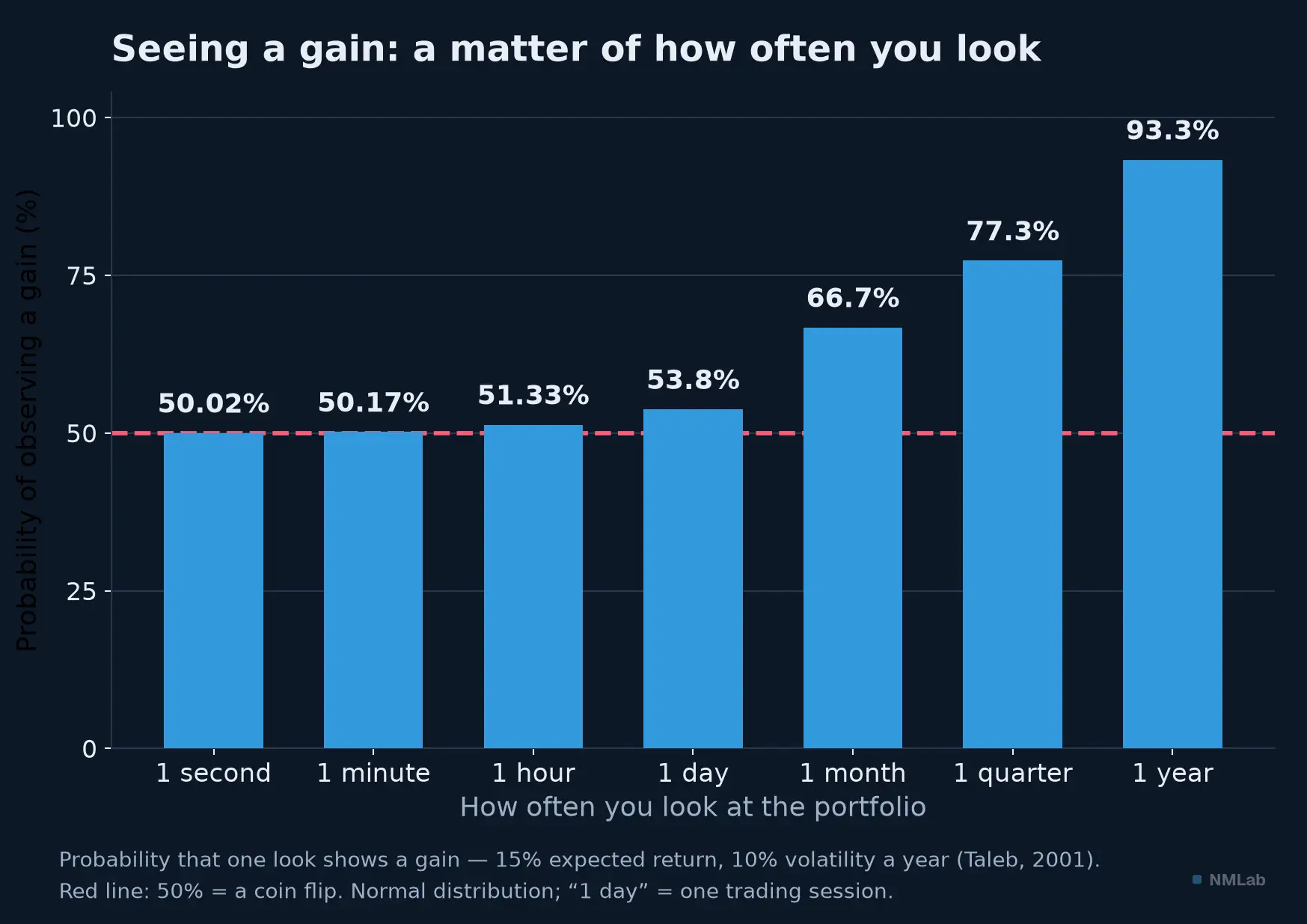
Below the day, everything blurs into the coin flip; at the year, skill becomes visible. Normal distribution, on Taleb's dentist example (2001).
Now this noise is not free: it acts on you. In 1997, Richard Thaler, Amos Tversky, Daniel Kahneman and Alan Schwartz ran the direct experiment: participants managed a simulated investment and differed only in how often they received feedback. Verdict: the more often subjects saw their results, the less risk they took, and the less they earned. This is myopic loss aversion, theorized two years earlier by Shlomo Benartzi and Thaler: a loss hurts roughly twice as much as an equivalent gain pleases, and whoever checks often sees many passing losses — hence suffers, hence overreacts. Checking your portfolio ten times a day is not diligence: it is a self-inflicted anxiety regimen, which degrades the very decisions it claims to inform.
That is why the answer to the deluge is not "more willpower" but a procedure: deciding in advance what to watch, how often, in what order — and treating the rest as entertainment. A routine protects attention the way a budget protects savings: not through virtue, through structure.
The architecture: three clocks, three questions
The whole routine fits into one rule and three clocks. The rule: monitoring follows the frequency of your decisions, not the news flow. A saver who adjusts an allocation twice a year has no use for the markets' tick-by-tick; an active investor needs a daily check — a short one. In both cases, monitoring serves your slow decisions — allocation, rebalancing, scheduled contributions — not a firing post.
Then the three clocks, one question each. The day observes: what has changed since yesterday? Fifteen minutes, watch in hand. The week interprets: what do the week's dots, laid end to end, say? One hour, on the weekend. The month revises: does my reading of the regime — growth, inflation, rates — still hold? Two to three hours, around month-end. Below the day: noise; beyond a quarter without a review: a map that has gone stale.
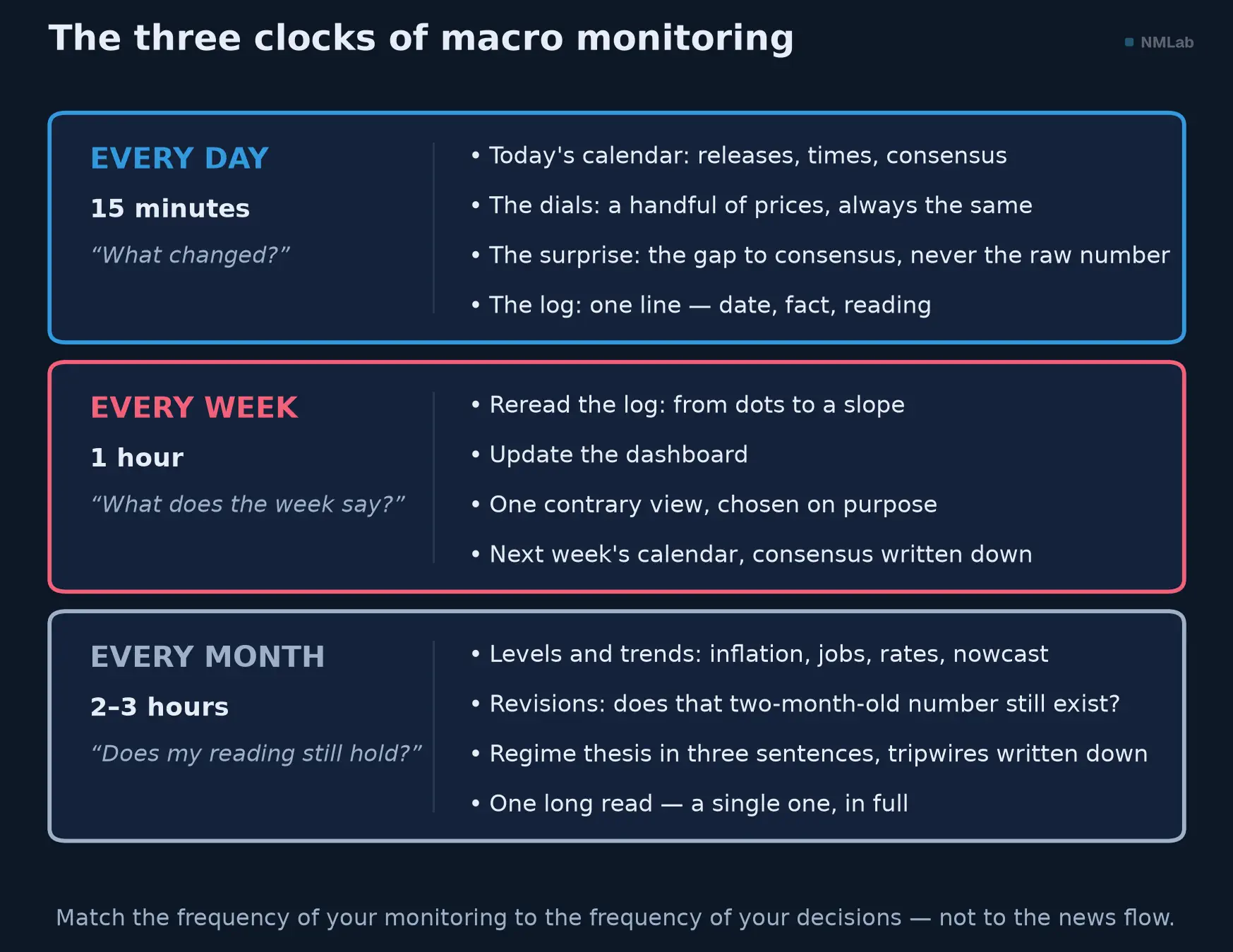
Three clocks, three questions: the day observes, the week interprets, the month brings the map up to date.
The quarter hour in the morning: observe
The daily ritual is a checklist, in the literal sense. Atul Gawande told how a simple list — born in 1930s aviation, imported into the operating room — removes most of the errors experts make: not because they don't know what to do; memory buckles under load. Macro monitoring calls for the same remedy: same gestures, same order, every day — repetition makes change visible.
First gesture, two minutes: the calendar. Which releases drop today, at what time, with what consensus? The previous chapter installed the rhythm: European statistics in the morning — INSEE at breakfast, Eurostat late morning —, the American ones at 8:30 a.m. in Washington (2:30 p.m. in Paris), under embargo. A day with a jobs report, a CPI print or a central-bank meeting is not an ordinary day: Pavel Savor and Mungo Wilson measured that, over half a century of American data, scheduled announcement days returned on average 11.4 basis points of excess return, against 1.1 for all other days — most of the equity risk premium is earned on the days the economy speaks. Knowing in the morning that "today is a CPI day" is enough to reinterpret the whole session — and to conclude nothing before the number is out.
Second gesture, five minutes: the dials. The panorama equipped your dashboard with six dials — growth, inflation, the central bank, rates, employment, the outside world. Day to day, you skim a handful of prices that summarize them, always the same ones, in the same order: the U.S. 10-year yield and its move since yesterday, the slope of the curve, euro-dollar, oil, one broad equity index, the VIX. You are not looking for news: you are looking for gaps — a price that is not where yesterday's routine left it. A price that has moved without news is information in itself, often the most interesting of the day.
Third gesture, five minutes: the surprise. If there was a release, one question only — the gap to consensus, never the raw number: the surprise makes the reaction, not the level. Then the previous chapter's reflexes, at speed: the margin of error mutes small gaps, the first estimate will be revised, soft is not hard. Ten seconds of discipline defuse a screaming headline.
Fourth gesture, three minutes: the logbook. One line a day: the date, the salient fact, your reading in one sentence — "CPI above consensus, the 10-year climbs, the market pushes back the rate cut." This monitoring log looks trivial; it is the most profitable tool in the routine. It turns the flow into consultable memory, forces you to formulate — you discover you have no reading at the moment of writing, not at the moment of losing — and vaccinates against hindsight bias, that rewriting which makes people say "I saw it coming": the logbook, for its part, remembers what you actually thought.
Three anti-rules close the ritual. Numbers before opinions: never social media or commentary before the prices and the calendar — otherwise you will read the data through the thesis of the first take you ran into. No personal-portfolio prices inside the macro quarter hour: Thaler and his co-authors showed what the personal tick-by-tick does to judgment. And rolling news stays closed: if something important happens, tomorrow's routine will catch it — that is precisely its function.
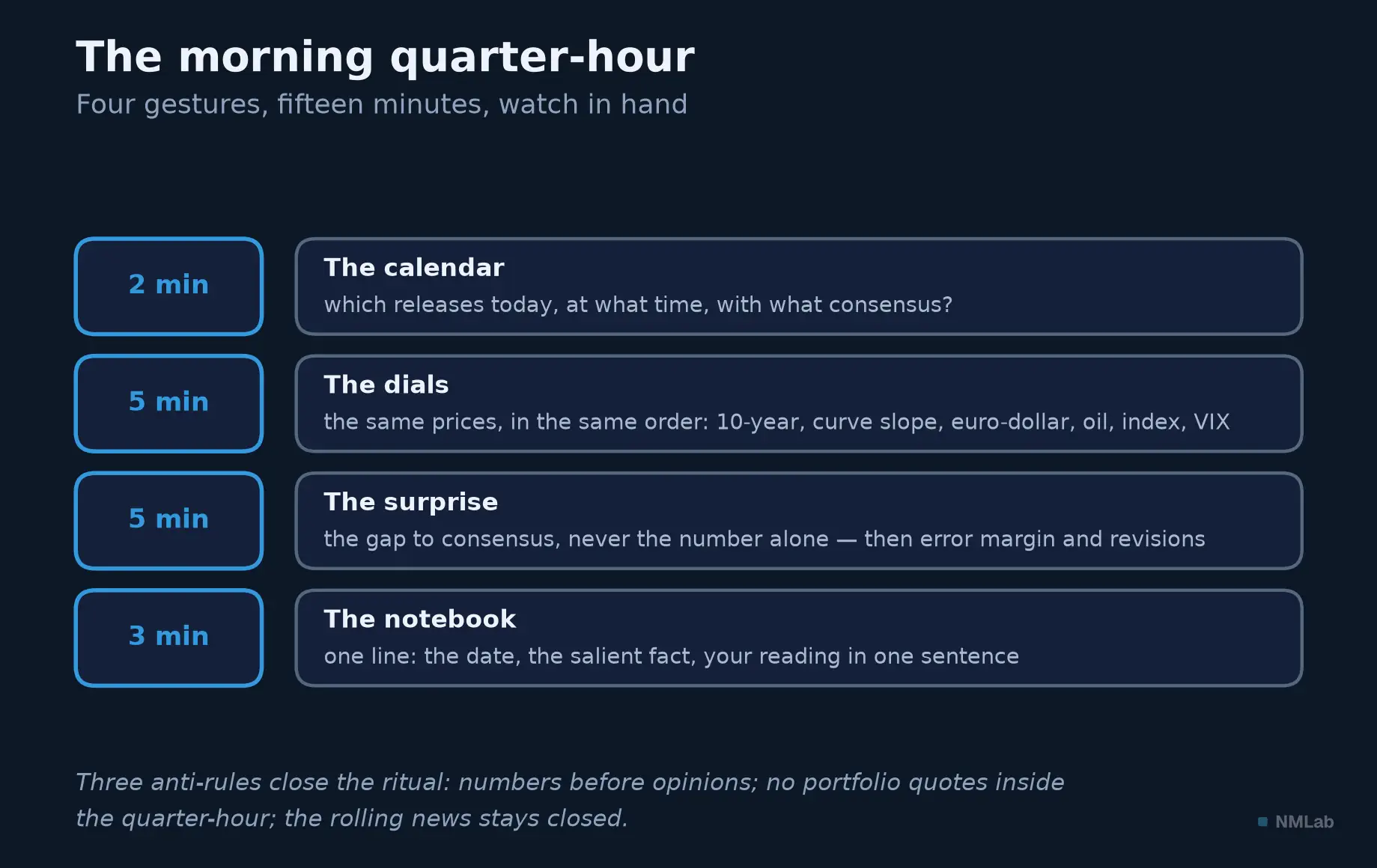
Fifteen minutes, four gestures, always in the same order — and three anti-rules to keep the deluge at bay.
The weekend hour: interpret
Saturday or Sunday, one hour, coffee in hand. First, reread the five lines of the logbook: the day sees dots, the week sees a slope. What is the week's story — disinflation firming up, a labor market fraying, a central bank hardening its tone? If the five lines tell nothing, that too is information: a week without a signal, and that is perfectly fine.
Next, update the dashboard — the file whose template the next section gives: the week's new values, the three-to-six-month trend, nothing else. Then the most counterintuitive exercise: read one contrary view — one piece of in-depth analysis, a single one, chosen because it concludes the opposite of what you think. Confirmation bias is not corrected by lucidity — nobody believes themselves partial — but by institution: a contradictor written into the agenda, every week.
Finally, prepare the coming week: open the economic calendar, highlight the two or three releases that matter for your thesis and your positions, write the consensus next to each. You will no longer be waiting for news: you will be testing hypotheses.
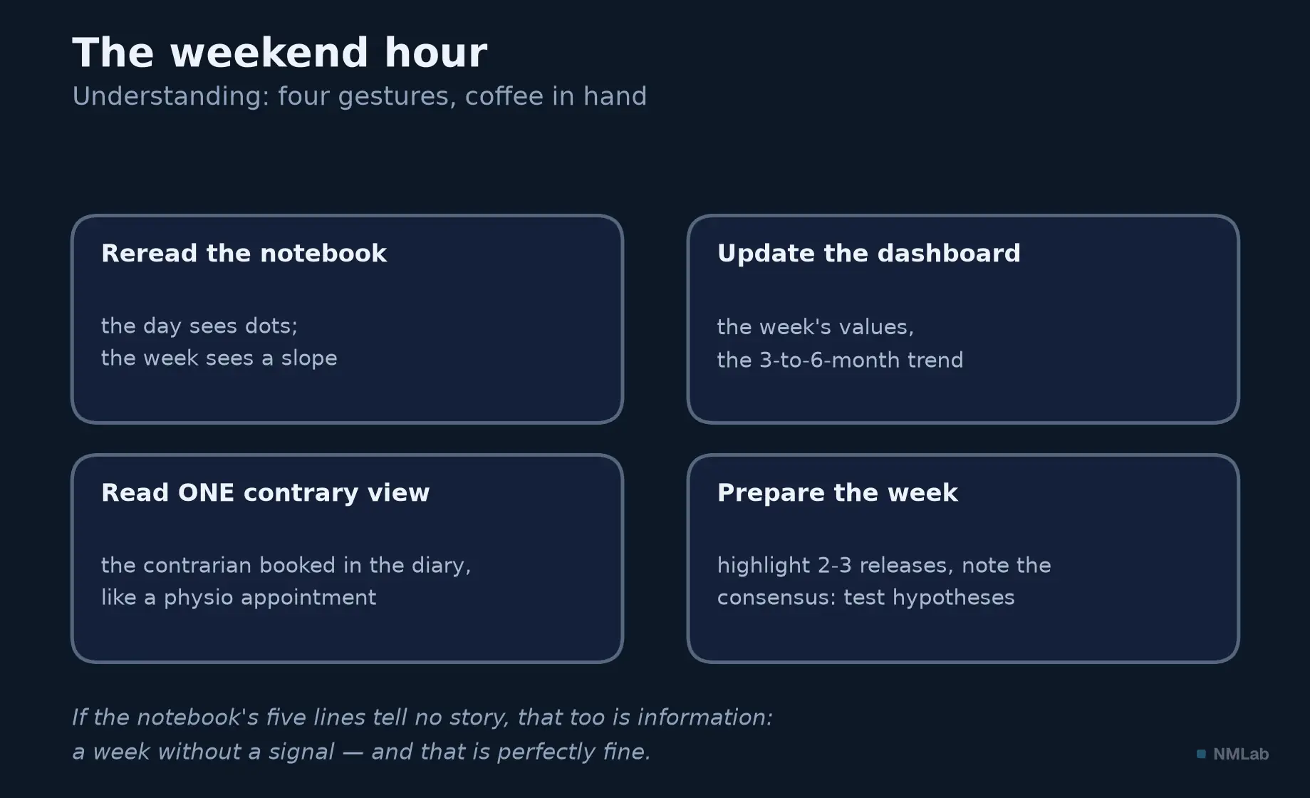
On Saturday you move from dots to slope: reread, update, contradict yourself, prepare.
The monthly review: bring the map up to date
The month is macro's natural unit: the previous chapter detailed its liturgy — the ISM on the first business day, the jobs report on the first Friday, the CPI around the 12th, the flash PMIs around the 23rd, PCE inflation at month-end; the Fed eight times a year, the ECB roughly every six weeks. When the statistical month closes, take two to three hours — four gestures.
One: the levels. Where do headline and core inflation, unemployment and payrolls, the policy rate and the 10-year yield stand, in level and in trend — and the nowcast of the quarter, the Atlanta Fed's GDPNow, updated after each major release? It is the difference between "the CPI surprised to the upside on Tuesday" and "core inflation has been running around 3% for six months": the first sentence is news, the second is a position on the map.
Two: the revisions. Does the number celebrated two months ago still exist? The previous chapter showed whole quarters changing sign and hundreds of thousands of jobs evaporating in the annual benchmark recalibrations. The review checks what has become of the first estimates — and corrects the story built on them.
Three: the regime thesis. Write down, in three sentences, your current reading: where do growth, inflation and monetary policy stand — and what would make you change your mind? Set tripwires in advance — "if the three-month average of core inflation moves back above such-and-such a level," "if unemployment rises by this much" —: it is the operational version of Marks's memo, prepare rather than predict. The pre-written threshold will decide coolly, on the day you would have decided hot.
Four: one long read. A chapter of this journey, a central-bank report, a study — a single one, but in full. Monitoring maintains the map; the long read enlarges it.
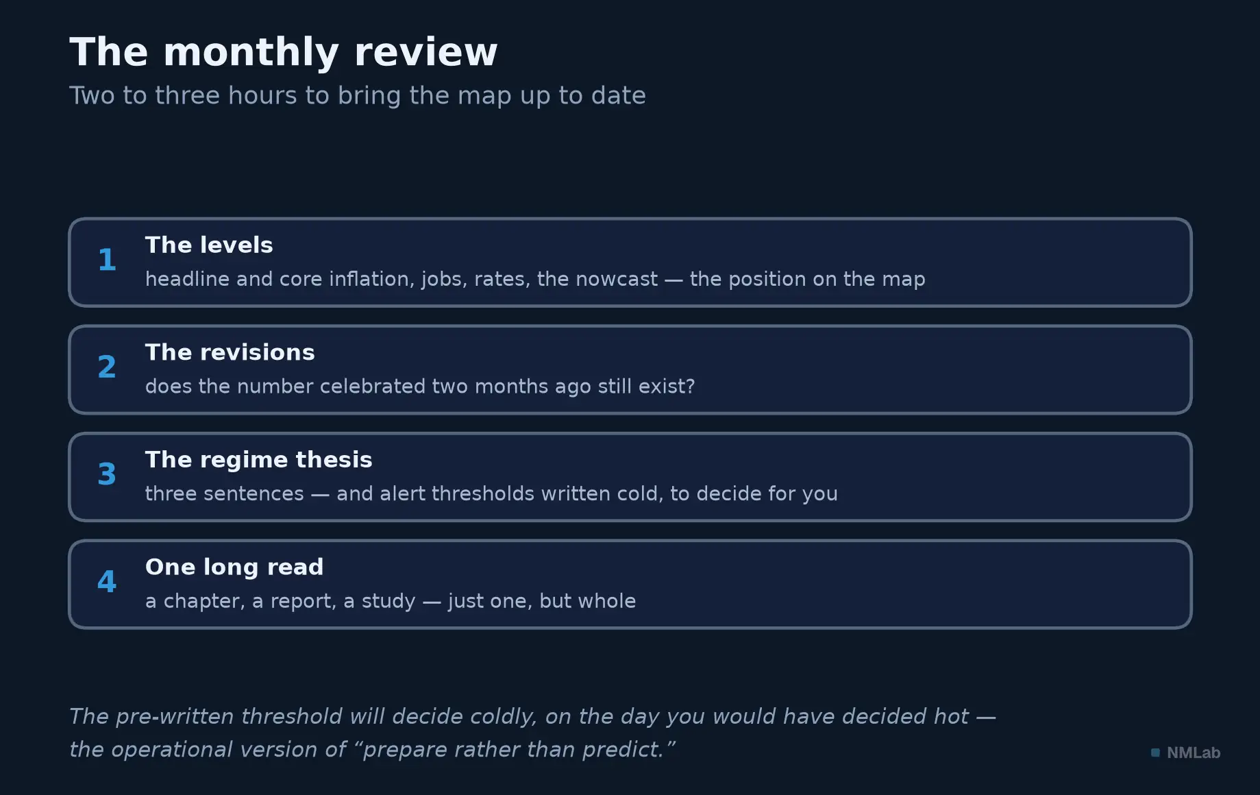
Levels, revisions, a regime thesis with tripwires written cold, one long read: the map is up to date.
The dashboard: eight rows, not forty
There remains the central tool, promised since the panorama: your personal dashboard. A spreadsheet is enough — eight to twelve rows, one per indicator, five columns: the latest reading, the previous one, the three-to-six-month trend, the next release, and — the most important — why I track it. A row whose last column you can no longer fill in gets deleted: that is the rule that keeps the dashboard from swelling into a second source of anxiety.
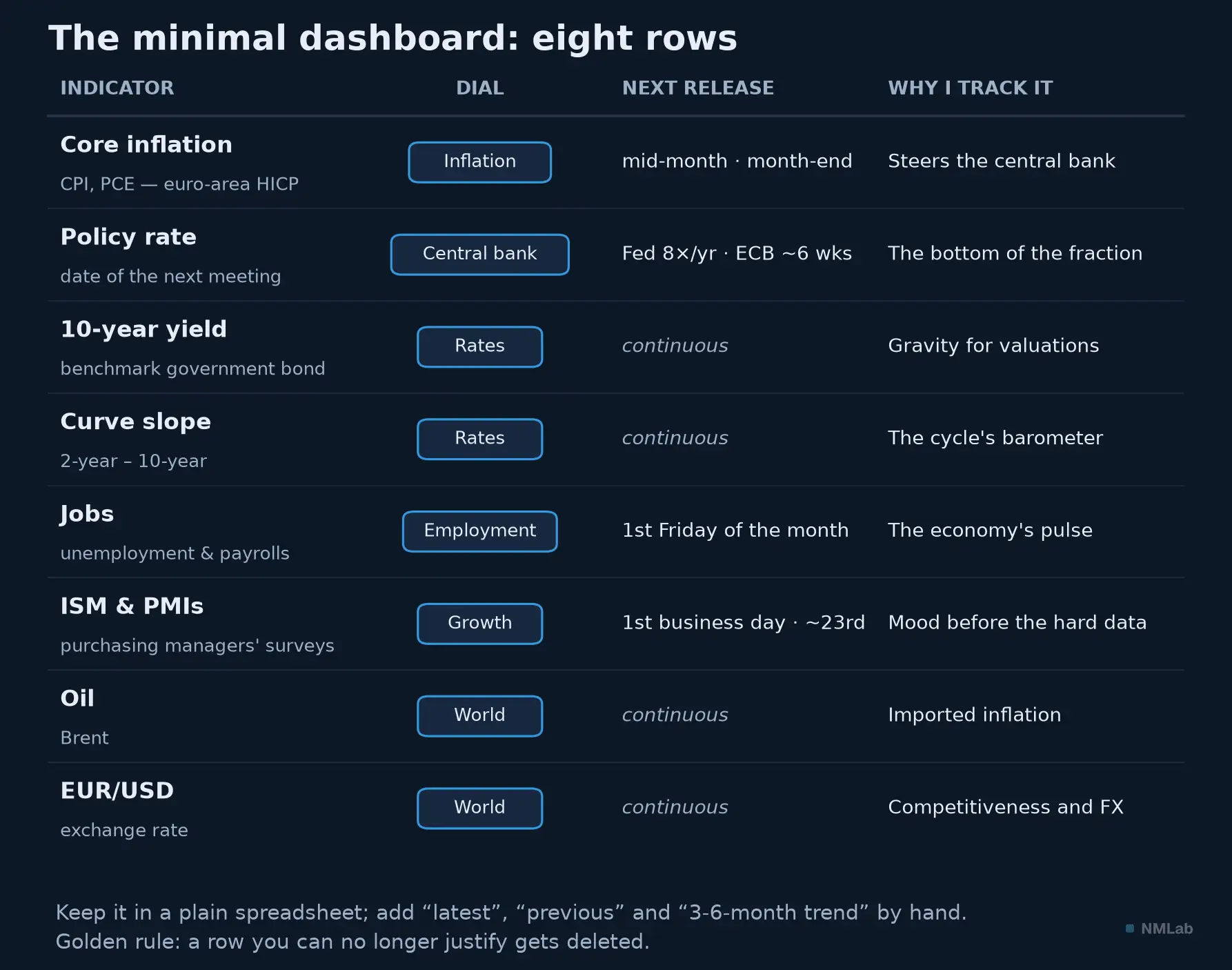
The starter kit: eight rows, each tied to a dial and dated with its next release. Add the "latest" and "trend" columns by hand — the gesture that imprints.
The starter kit reads off the figure: core inflation (U.S. CPI and PCE, HICP for the euro area), the policy rate and the date of the next meeting, the 10-year yield, the slope of the curve, jobs, the ISM and the PMIs, oil, euro-dollar. Each row descends from a dial of the panorama; together they cover the whole fraction — future income in the numerator, the discount rate in the denominator. Fill it in by hand, every week: friction is the price of memory. Nothing to install: the previous chapter took care of that — FRED and its saved charts give you the series, the institutes' sites the releases, an economic calendar the dates, times and consensus. Add two recurring calendar alerts — the jobs report, the CPI — and two chosen newsletters, not fifteen. And cut the notifications: a routine is something you visit; it does not interrupt you.
The known traps: over-monitoring, confirmation, the itchy trigger
Four traps lie in wait, each with its parry. The first is over-monitoring: confusing being informed with being prepared, adding sources until you have recreated the deluge you were fleeing — the 1997 experiment established it, more feedback degrades decisions. The parry is arithmetic: the routine has a time budget — fifteen minutes, one hour, half a day a month — and any lasting overrun signals a problem, not zeal.
The second is confirmation bias, which turns monitoring into ammunition-gathering for the thesis you already hold. Parries: the weekend's contrary view, and the logbook — writing your reading down before knowing what came next makes it impossible to cheat with your memory.
The third is the itchy trigger: converting monitoring into trading signals — the most expensive confusion. The panorama showed it: the markets' reaction to a number depends on the regime — good economic news can be bad market news — and is played out in seconds, by machines. It can even precede the announcement: David Lucca and Emanuel Moench documented that between 1994 and 2011, about 80% of the excess return on U.S. equities was earned in the twenty-four hours before the Fed's announcements. And here is the rest of the story, which carries its own lesson: since the paper was published, the effect has clearly weakened — later work, including the New York Fed's own, no longer finds much of it after 2011. That is the ordinary fate of anomalies once published: described, they are exploited, and exploitation erases them. Chapter 2 called it reflexivity; here is a textbook case, and one more reason not to build a routine on a calendar regularity. Do not try to run that hundred-meter dash: monitoring feeds your slow decisions, and one simple rule protects the impulsive — no portfolio decision on the day of a release, unless the plan was written in advance.
The fourth is all-or-nothing: three weeks of exemplary routine, one trip, one busy week — and abandonment. The parry is called the minimum viable routine: a three-minute fallback version — the day's calendar, the 10-year, one line in the log — that you never skip, even on holiday. You expand on the good days; you never go below the floor. Adjust the ambition to your profile: the long-term saver can live on the monthly review alone; the active investor gains from all three clocks; day trading, for its part, is another trade altogether — outside this module's scope.
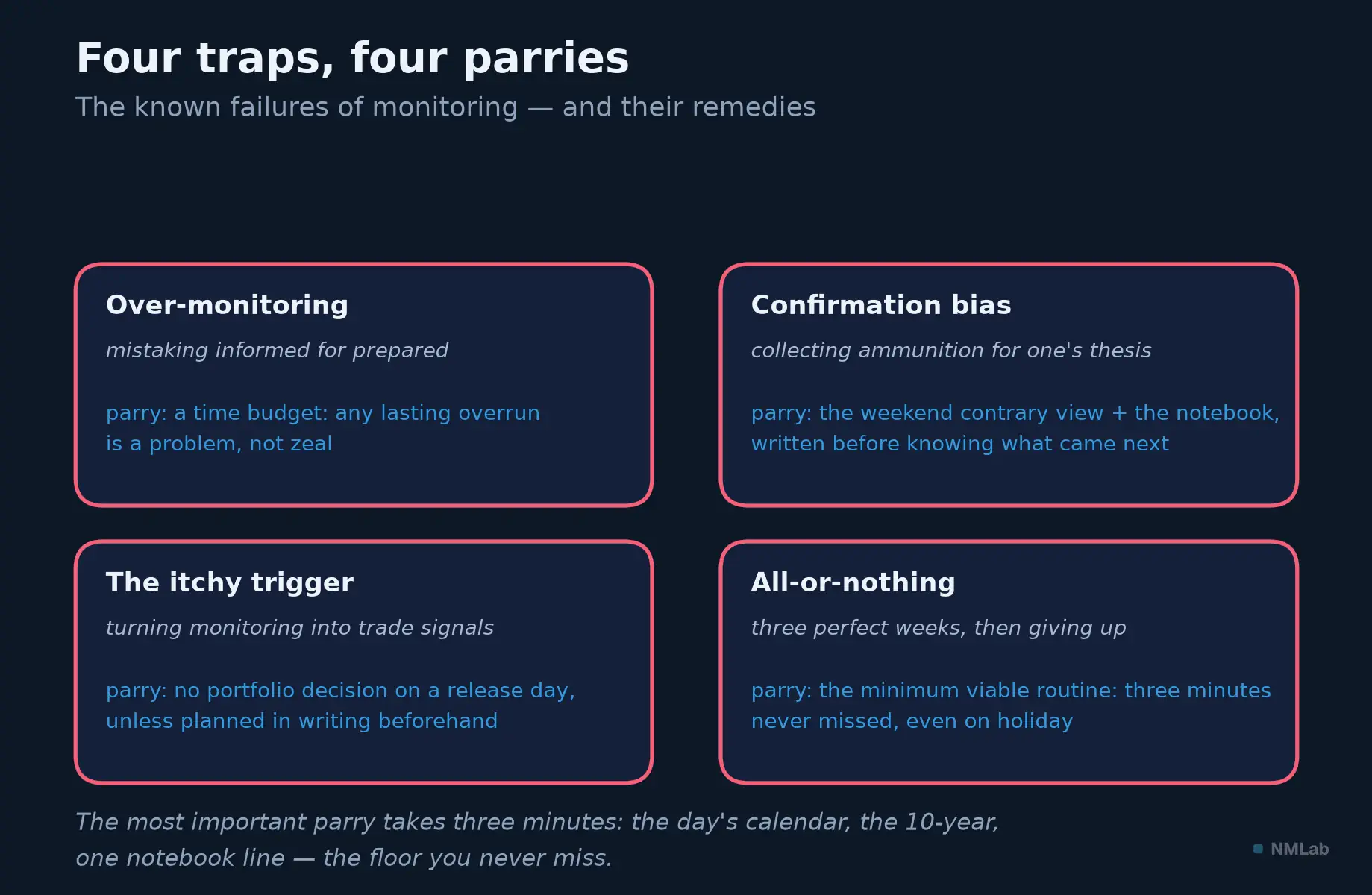
Each trap has its parry — the most important one fits in three minutes you never skip.
Module 1, the balance sheet: the toolbox is complete
Look at the road covered. You know what financial macroeconomics is and why it steers your investments — the fraction: future income on top, the discount rate below. You know at what scale it reasons, and why the whole is not the sum of the parts. You know the six dials of the dashboard, the language that describes them, the making — and the weaknesses — of the numbers that feed them. This chapter added the piece that transforms the others: a system for practicing. For macroeconomic culture is like a living language: without practice it evaporates in a few months; with a quarter of an hour a day, it compounds like interest.
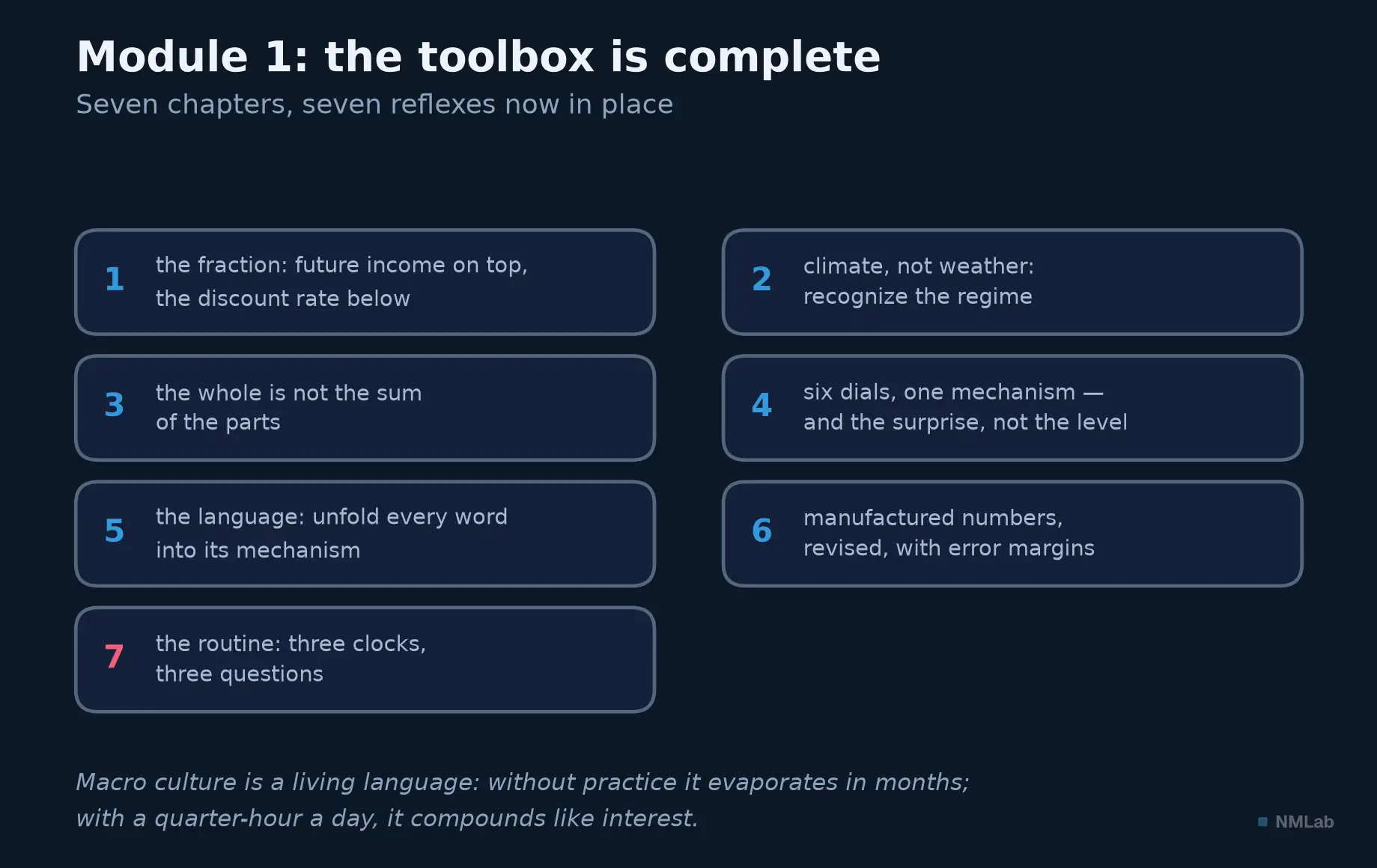
Seven chapters, seven reflexes: the setting-out is complete — what remains is to practice.
Key takeaway
- A procedure, not a news feed — Monitoring is decided in advance: what to watch, when, in what order, and what to ignore. It protects attention the way a budget protects savings: not through virtue, through structure.
- It observes, it does not predict — Not "what is going to happen?", but "which regime are we in, and what has just changed?". You can't predict; you can prepare.
- Three clocks — The day observes: calendar, dials, surprise against consensus, one line in the log — fifteen minutes. The week interprets: rereading, dashboard, one contrary view. The month revises the map: levels, revisions, regime thesis and tripwires.
- Frequency is a trap — Looking more often does not make you see sooner: it makes you see more wrongly. At high frequency you observe variance, not performance; excess feedback degrades decisions. Set the routine on the frequency of your decisions, never that of the wires.
- The floor, never the ceiling — The minimal version — three minutes — is never skipped. A routine is something you visit; it does not interrupt you.
The rest of the journey
Module 1 ends, and with it the setting-out. The next chapter closes it not with theory, but with a story: "The map of the journey: from COVID to the soft landing (2020-2025)" will tell in one piece the shock of 2020, the stimulus, the inflation flare-up, the most brutal tightening in forty years, then disinflation and the landing — five years that make the best training ground for your brand-new routine. Until then, start small and start Monday: the calendar, a handful of prices, one line. And keep this chapter's rule: you can't predict, you can prepare — the routine is the tool of preparation, and yours begins with three minutes you never skip.
Sources and further reading
- Peter Lynch (with John Rothchild), One Up on Wall Street (1989) — the quip about the "13 minutes" a year spent analyzing economic and market forecasts, popularized under his name and quoted in varying wordings.
- Howard Marks, "You Can't Predict. You Can Prepare.", memo to Oaktree Capital clients (November 20, 2001) — prepare rather than predict, the bedrock of the regime thesis and its tripwires.
- Herbert A. Simon, "Designing Organizations for an Information-Rich World," in Computers, Communications, and the Public Interest (ed. M. Greenberger, Johns Hopkins Press, 1971) — "a wealth of information creates a poverty of attention."
- Brad M. Barber & Terrance Odean, "All That Glitters: The Effect of Attention and News on the Buying Behavior of Individual and Institutional Investors," Review of Financial Studies (2008) — attention-driven buying among retail investors.
- Nassim Nicholas Taleb, Fooled by Randomness (2001) — the dentist parable: 93% winning observations at the yearly scale, 50.17% at the minute, for one and the same portfolio (15% expected return, 10% annual volatility).
- Shlomo Benartzi & Richard H. Thaler, "Myopic Loss Aversion and the Equity Premium Puzzle," Quarterly Journal of Economics (1995) — myopic loss aversion.
- Richard H. Thaler, Amos Tversky, Daniel Kahneman & Alan Schwartz, "The Effect of Myopia and Loss Aversion on Risk Taking: An Experimental Test," Quarterly Journal of Economics (1997) — more feedback, less risk-taking, lower earnings.
- Pavel Savor & Mungo Wilson, "How Much Do Investors Care About Macroeconomic Risk? Evidence from Scheduled Economic Announcements," Journal of Financial and Quantitative Analysis (2013) — 11.4 basis points of excess return on announcement days, against 1.1 on all other days (1958-2009).
- David O. Lucca & Emanuel Moench, "The Pre-FOMC Announcement Drift," Journal of Finance (2015) — about 80% of the S&P 500's excess return earned in the 24 hours before FOMC announcements (1994-2011); effect largely dissipated since 2011, as later Federal Reserve Bank of New York work has noted — an illustration of what happens to anomalies once published.
- Atul Gawande, The Checklist Manifesto (2009) — the checklist, from aviation to the operating room: converting expertise into reliability.
- Daniel Kahneman, Thinking, Fast and Slow (2011) — hindsight bias, which the monitoring log neutralizes.