15. Potential Growth and the Output Gap: The Map No One Can Measure
· Updated on · 15 min read
In the 1970s, the U.S. Federal Reserve let the worst inflation of the postwar era run loose. For a long time it was blamed on a failure of nerve: central bankers too timid to tighten. The truth, revealed much later by the economist Athanasios Orphanides, is more troubling — and more instructive. The Fed did not lack nerve: it had the wrong map.
At the turn of the 1970s, American productivity slowed sharply (you saw it in chapter 12, the "black hole" of 1973-1995). But that slowdown was invisible at the time: it takes years of hindsight to measure. So the Fed went on believing the economy could produce far more than it actually could. It estimated the gap between real and potential output — the output gap — as deeply negative, as if the economy were running well below its capacity; convinced of an economy running cold, it kept policy too loose, and inflation set in.
Orphanides proved it in 2002, figures in hand: a monetary-policy rule fed with revised data — the data we know today — would have avoided the Great Inflation; but the same rule, fed with the output-gap estimates actually available at the time, reproduces the observed inflation exactly. The Fed did not play badly; it played correctly, with a false map. This chapter — the most "advanced" of the module — is about that map: potential GDP and the output gap. Two figures omnipresent in central-bank speeches, two figures that no one can measure.
At a glance — Level: Advanced · Prerequisites: chapter 12 and chapter 14
By the end of this chapter, you will be able to:
- say what potential GDP and the output gap are, and why nobody can measure them;
- explain why the Great Inflation came from a false map, not from a lack of nerve;
- read the direction of these numbers without lending them a precision they do not have.
The most technical chapter in the module: it deals with latent variables and their revisions. The main thread follows without the estimation details.
A line you never see
Let's start with the definitions, because they hide a trap. Potential GDP is the level of output an economy can sustain durably without overheating — without inflation running away. It is its "cruising speed": neither the maximum it can reach by overexerting, nor a physical ceiling, but the tenable pace, where all capacity is employed without excessive strain. Its growth, potential growth, is the sum of two forces you already know: how many hands the economy gains (demography, chapter 14) and how much each hand produces (productivity, chapter 12). The output gap measures the distance between real GDP and this potential, in percent: (real GDP − potential GDP) ÷ potential GDP. Positive, the economy runs above its cruising speed — overheating, inflationary pressure. Negative, it runs below — unemployment, idle capacity, disinflation.
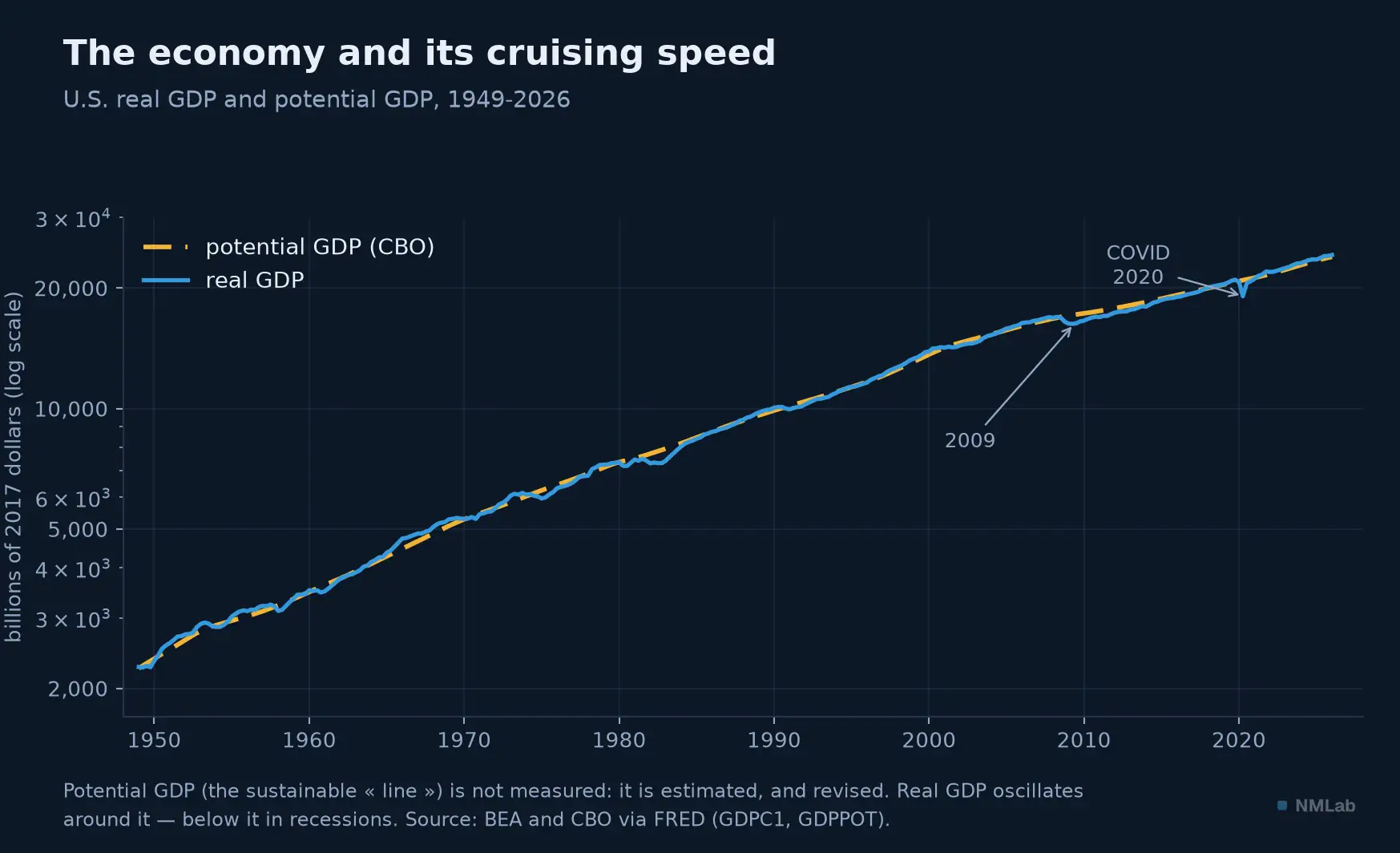
The two curves almost merge: real GDP (blue) hugs its potential line (amber). But that line, so crisp on the chart, does not exist in reality — it is reconstructed by a model.

And here is the trap, the one that makes this chapter a lesson in humility: potential GDP is not measured. Look at the chart, the amber line looks as solid as the blue one — it is not. Real GDP we measure, the output did happen; but potential is a theoretical quantity, output that could have happened, estimated by models from assumptions about full employment and trend productivity. Two serious institutions produce, for the same date, two different figures. And — this is where everything turns — each revises its own past figures. The output gap is what economists call a latent variable: real in its effects, but never observed directly. A map, never the territory.
The pulse of the cycle
Despite this fragility, the output gap remains one of the most-watched instruments, because it tells you in a single figure where the economy stands in its cycle. Let's follow it through time.
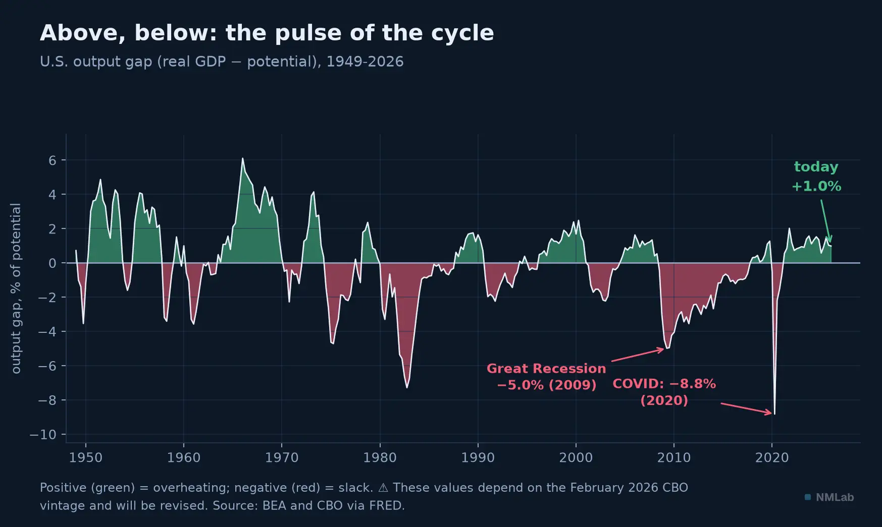
Positive in green (overheating), negative in red (slack). The chasm of 2020 — nearly −9% — is the deepest of the entire modern series.
The story is in the troughs. At the depth of the Great Recession, in mid-2009, the gap plunges to −5%: the American economy was producing five points less than it could have, a hemorrhage of capacity and jobs. In the spring of 2020, the pandemic lockdown digs an unprecedented abyss, −8.8% — the deepest ever recorded. Conversely, the peaks signal overheating: the late 1960s mark the high record, above +6%, just before the inflation of the 1970s. And today? The gap is slightly positive, on the order of +1%: the American economy runs a notch above its estimated cruising speed. A slight overshoot, not overheating — but a signal the Fed watches. Why? Because the output gap is the bridge between activity and inflation. It is the idea of the Phillips curve: when the economy runs above potential, the labor market tightens, wages accelerate, prices follow. A positive gap would therefore be an inflation warning; a negative gap, a promise of disinflation.
Except that this bridge has sagged, and it must be said before going further. The relation between one year's output gap and the change in core inflation the following year was clear until the mid-1980s; since then it is nowhere to be found — the chart below puts the two periods side by side. This is the flattening of the Phillips curve, one of the best-established facts of recent macroeconomics, and the leading explanation is as reassuring as it is ironic: central banks anchored inflation expectations so well that the very relation they relied on stopped being visible — Goodhart's law from chapter 6, once again. The same "+1%" therefore does not say the same thing in 1968 and in 2026. That is why these two unobservable figures decide, in practice, the direction of interest rates — and why they decide it far less sharply than they once did.
Okun's law: the twin of unemployment
The output gap has a twin, on the employment side, and it is a little less elusive. In 1962, the economist Arthur Okun noticed a regularity so robust it was dubbed, wrongly, a "law." His original wording: "on average, each extra percentage point in the unemployment rate above four percent has been associated with about a three percent decrement in real GNP." In other words, unemployment and underproduction go together, in a roughly stable ratio.
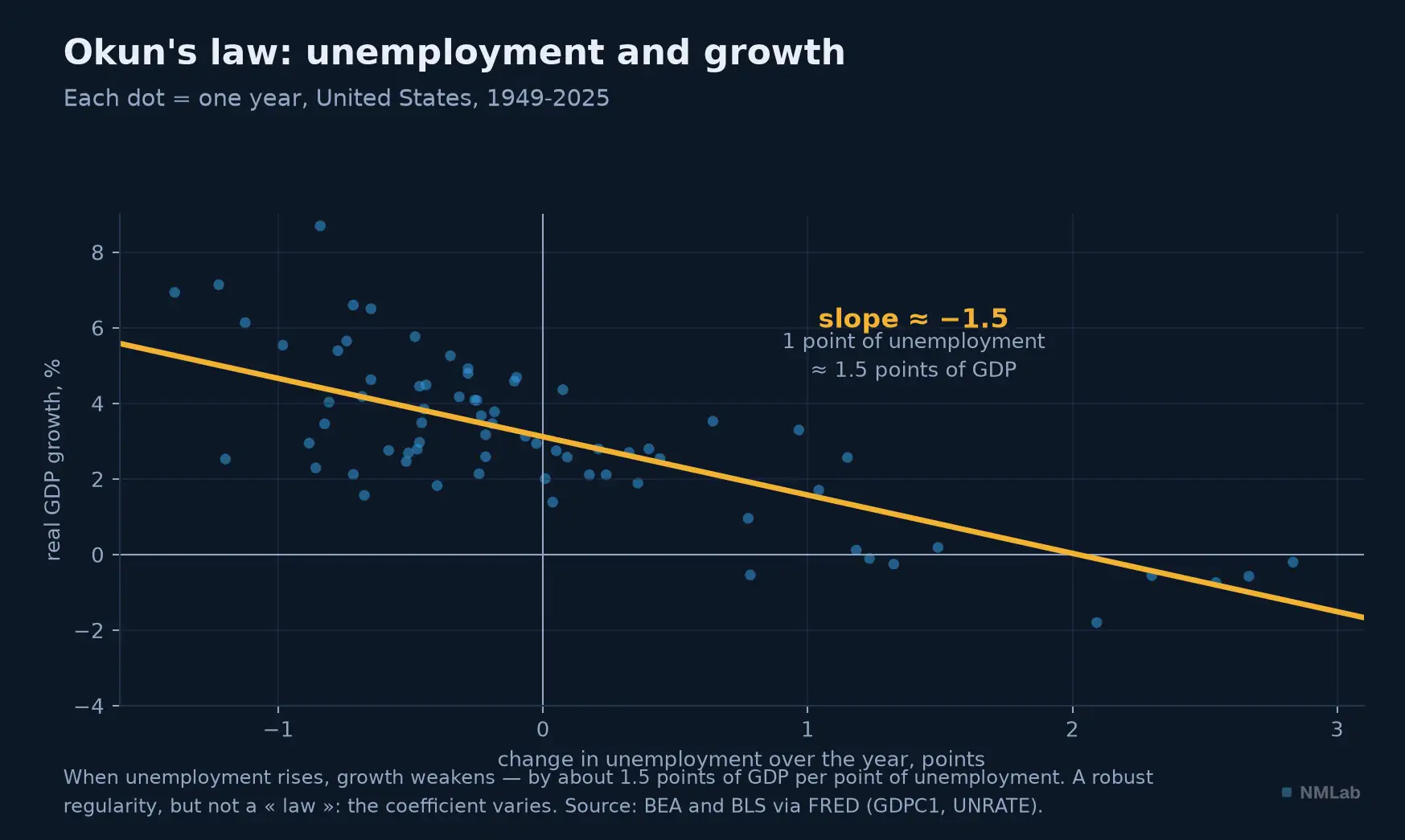
Each dot is one year. The cloud clearly slopes: the more unemployment rises, the more growth weakens. On annual data, the line gives about 1.5 points of GDP per point of unemployment.
The scatter above puts the regularity before your eyes, over three-quarters of a century. The slope is undeniable — when unemployment climbs a point over the year, growth loses, in my calculations on annual data, about a point and a half of GDP. But note the range: Okun found 3-for-1 in his "gap" version, modern textbooks favor 2-for-1 in the "growth" version, my data give 1.5. The coefficient is not a constant of nature; it varies by period, country, method. That is precisely why "Okun's law" is a misnomer — the term was popularized after the fact, in the 1960s, whereas Okun himself never spoke of a law. Remember the relationship, distrust the exact figure: that will be the thread through this whole chapter.
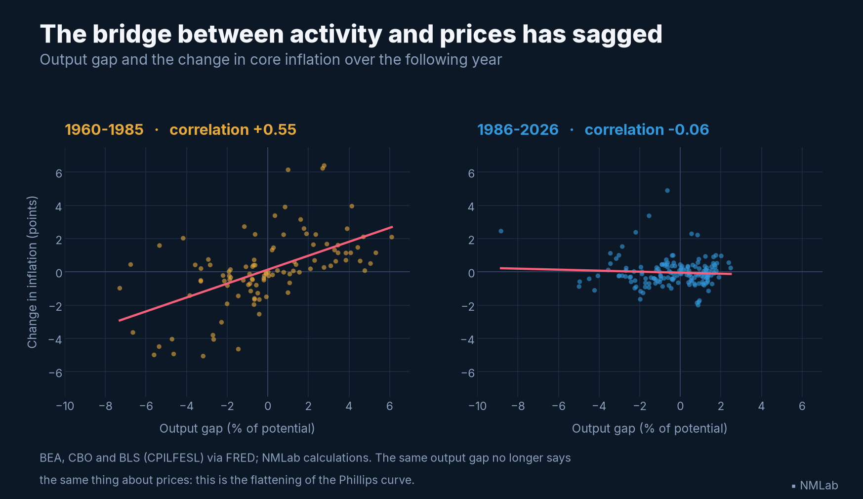
The output gap's other bridge — the one leading to prices — has sagged: clear before 1985, undetectable since. The same number no longer says the same thing.
The noise is as big as the signal
We come to the heart, and to the reason this chapter carries the "advanced" label. We said the output gap gets revised. But by how much? The answer, established by Orphanides and Simon van Norden in a blunt-titled 2002 study — The Unreliability of Output-Gap Estimates in Real Time — should give pause to anyone who takes these figures seriously. Their result, in one sentence: the revisions of the output gap are of the same order of magnitude as the output gap itself. Read that again. The figure announced today — "the economy is running 1% above its potential" — will be revised, in the years to come, by an amount comparable to its own value. The noise is as big as the signal. A gap estimated at +1% today could, once the data are consolidated and the trends re-evaluated, become −1% or +3% without any real past data having changed: it is the revision of the estimate, not of reality.
Where does this vertigo come from? The authors are categorical: the problem is not so much the revision of raw GDP data, it is the estimation of the end-of-sample trend — that is, precisely there, today, where the decision-maker needs it. Drawing a trend through the middle of a long series is easy; drawing it at its very end, without knowing what comes next, is a gamble. And a counterintuitive detail Orphanides and van Norden stress: the "sophisticated" methods that add inflation to refine the estimate are no more reliable than the simple ones. There is no escaping it through technique. James Hamilton drove the point home in 2018, in an article whose title is an order: Why You Should Never Use the Hodrick-Prescott Filter. That filter, the most widespread tool for extracting a trend and hence an output gap, produces, in his view, spurious dynamic relations with no basis in the data, and its usual setting has no statistical justification. Above all, it is especially unreliable at the end of the sample — Orphanides's very ailment. Hamilton proposes a more robust alternative, but concedes the general lesson: there is no perfect filter. Whatever the method, estimating the trend where you need it — now — remains the most fragile exercise in applied macroeconomics.
The most concrete proof lies in a figure from the recent period. Between its 2007 estimate and its 2014 estimate, the U.S. Congressional Budget Office cut its projection of potential GDP for 2017 by 7.3%. Seven points. And — most disturbing — the bulk of that revision was not due to the 2008 crisis itself, but to a re-evaluation of pre-crisis trends: the "line" we thought we knew was already wrong, before the crisis even struck. The economy's cruising speed, we had never really known it.
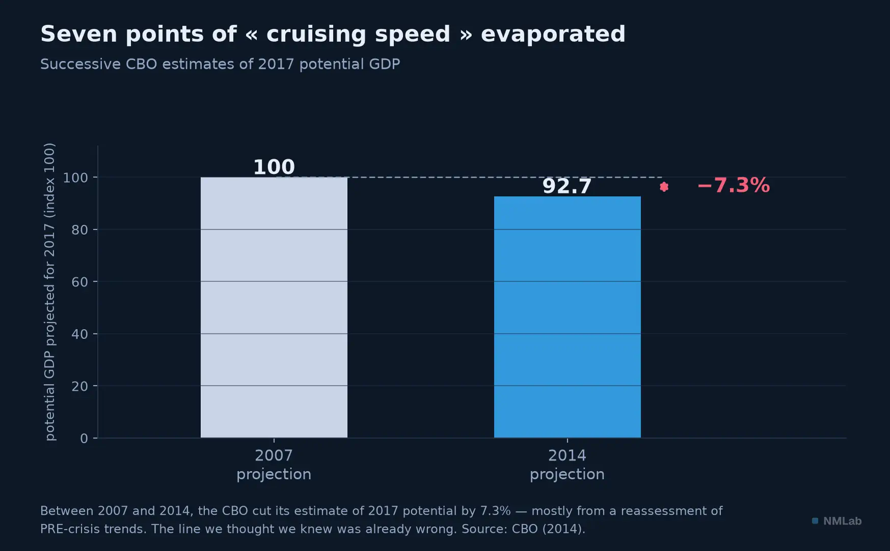
Seven points of "cruising speed" evaporated in a single revision — and most of it before the crisis even hit. That is the scale of the noise around the signal.
Three stars, one fog
What we have just said of potential GDP holds for a whole family of quantities economists mark with a star. The "natural" rate of unemployment, the NAIRU — the rate consistent with stable inflation, written u* — is the employment-side counterpart of potential GDP: also unobservable, estimated, revised. And the natural rate of interest, r*, which you met in chapter 11 and which chapter 16 will reopen — the one that tracks trend growth point for point — is cut from the same cloth. These three stars, y* (potential), u* (the NAIRU) and r* (the natural rate), are not independent: they are estimated together, in the same models, and revising one forces you to revise the others. When cruising speed falls, the natural rate falls with it. It is one and the same fog enveloping all three — and it is in that fog that central banks must steer.
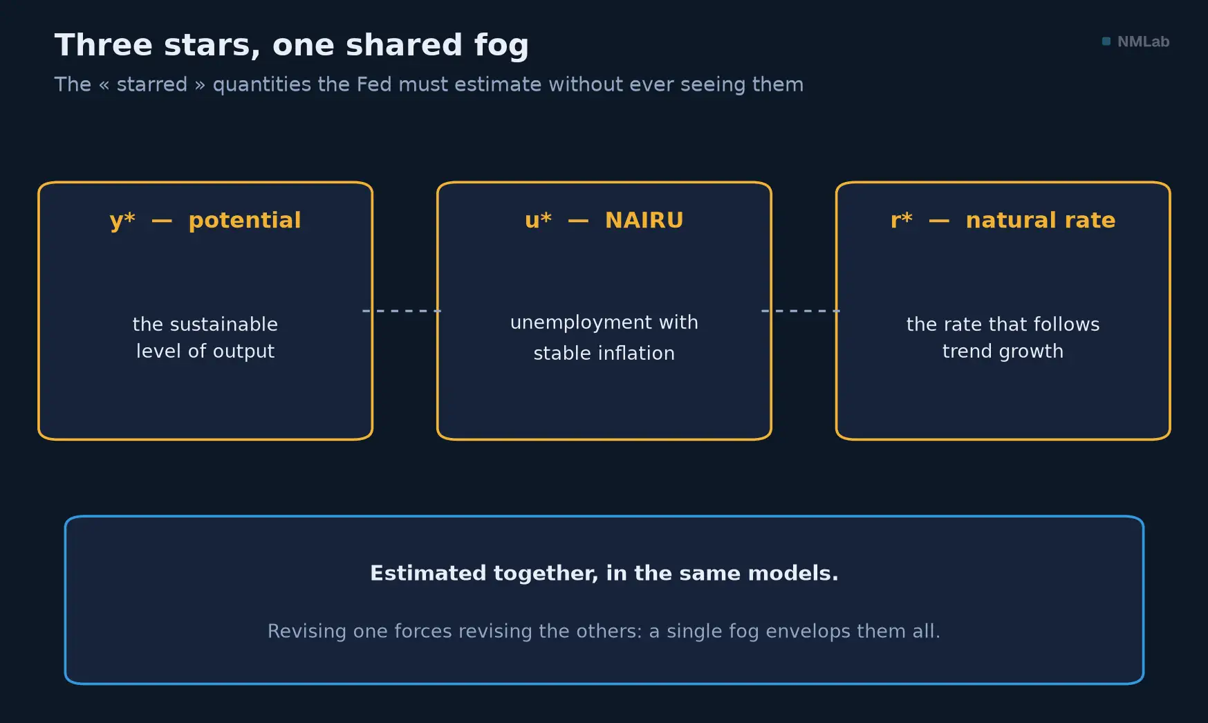
Potential, the NAIRU and the natural rate form a single family of latent variables: touching one shifts the others.
What it changes for an investor
Three practical consequences, and they all flow from the same humility. The first is to read the sign, not the decimal — and to remember that the link to inflation is today far looser than it once was. Today, the U.S. output gap is around +1%, and unemployment, at 4.2% in June 2026, has slipped below the estimated NAIRU (≈ 4.4%). The two signals agree: slight overshoot, an economy running a notch too hot — which argues for a Fed cautious about cutting rates, with a restrictive bias. Still, look at why unemployment has fallen back from 4.4% at the end of 2025: partly because workers are leaving the labor force, not because hiring is strong (chapter 13). And do not grant that "+1%" a precision it does not have: revised tomorrow, it may say something else. The second is that the Fed steers partly blind: when a governor justifies a decision by the output gap, remember Orphanides — a mechanically correct rule, fed with bad real-time estimates, produces bad decisions, and that is the story of the Great Inflation; so weigh commentary founded on these "stars" with healthy skepticism, for they are not facts but the best estimates of the moment.
The third, the most operational, is to watch the direction of revisions. A downward revision of potential GDP, like that of 2008-2014, is no accounting detail: it is the signal that an economy is structurally weaker than thought — hence that trend growth, the natural rate, and the long-run return on assets are, too, lower. The three stars move together, and they decide, in the last resort, the price of everything you hold. Never forget that today's vintage figures — a potential growing 2.1% a year, a gap of +1% — bear the date of their estimation, and that they will be rewritten.
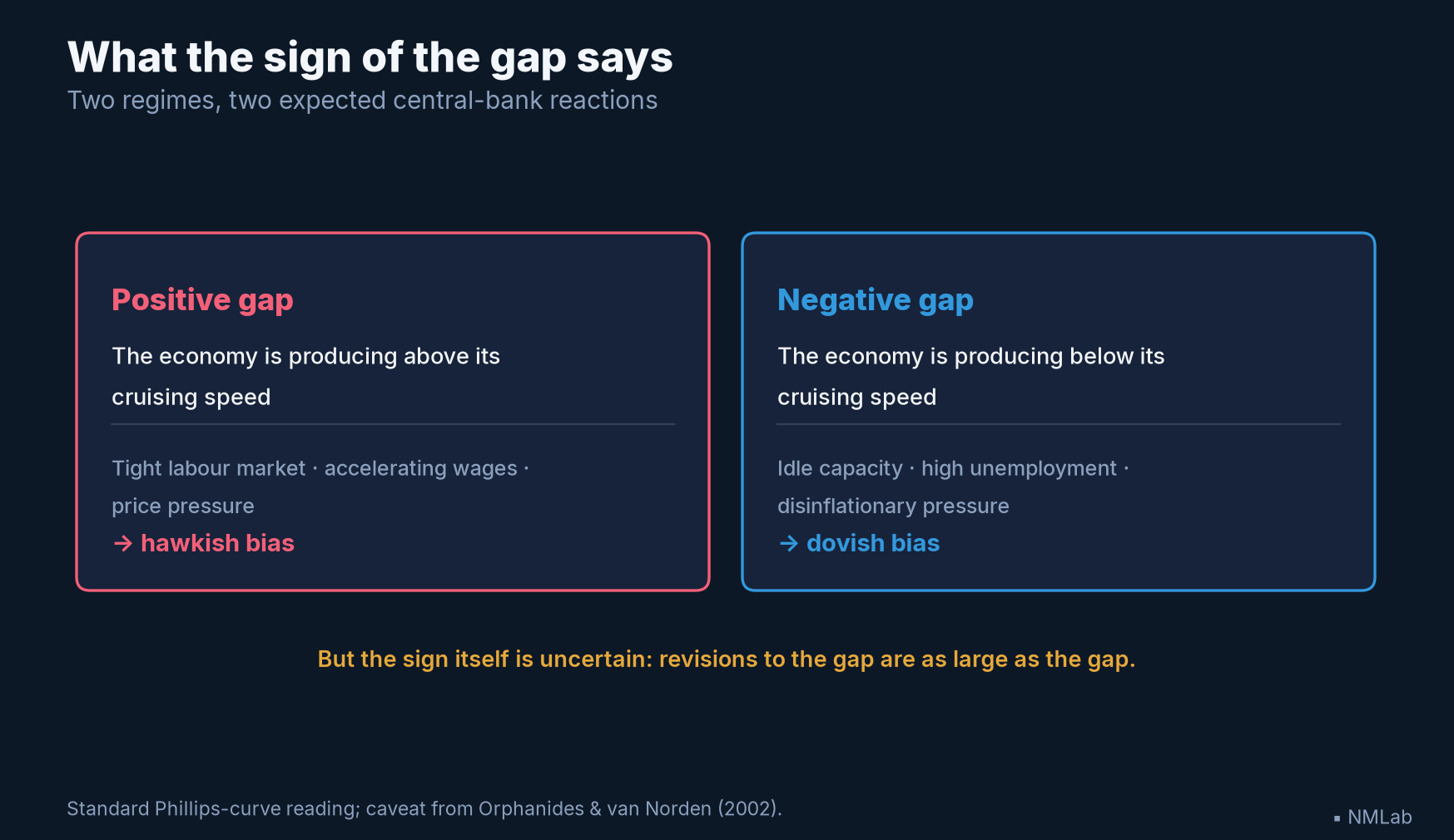
What the sign of the gap commands — and the warning that applies to both columns: the sign itself is uncertain.
Key takeaways
- Cruising speed — and unobservable — Potential GDP is the level of output sustainable without overheating; its growth = demography (ch. 14) + productivity (ch. 12). The output gap = (real GDP − potential) ÷ potential: positive = overheating, negative = slack. But neither is measured: both are latent variables, estimated then revised — a map, never the territory.
- The pulse of the cycle — Troughs of −5% in 2009, −8.8% in 2020 (record), a peak above +6% in the late 1960s. Today +1%: slight overshoot. A positive gap is supposed to warn of inflation — but that bridge has sagged: clear before 1985, absent since (flattening of the Phillips curve). The same number no longer says the same thing.
- Okun's law — Unemployment and underproduction go together (Okun, 1962). Coefficient from ~3 (gap version) to ~2 (growth version), ~1.5 on my annual data: real but not stable. It is not a "law."
- The noise = the signal — Orphanides & van Norden (2002): "ex post revisions of the estimated gap are of the same order of magnitude as the estimated gap itself." The ailment comes from estimating the trend at the end of the sample. Hamilton (2018): never trust the HP filter — and no filter is perfect.
- Three stars, one fog — Potential (y*), the NAIRU (u*) and the natural rate (r*) are the same family of latent variables, estimated together and revised together. The Fed steers in that fog.
- For the investor — Read the sign, not the decimal; weigh the "stars" with skepticism; watch the direction of revisions (a lower potential = durably lower growth and rates).
The journey ahead
We have just seen how hard an economy's "cruising speed" is to know — and yet it is what commands the natural rate and, step by step, the price of every asset. But where, concretely, does the fuel come from that lets an economy invest and grow? Who lends, who borrows, and at what price does the world finance itself? That is the whole question of saving and investment — the two engines financing the economy. Next chapter: "Saving and Investment: The Two Engines Financing the Economy". Until then, an exercise: look up the latest output-gap estimate for your country, then look up what the same institution said five years ago for the same year. The gap between the two will teach you more about macroeconomics than any single figure taken in isolation.
Sources and references
- Athanasios Orphanides, "Monetary-Policy Rules and the Great Inflation", American Economic Review 92(2), May 2002, pp. 115-120; and "Monetary Policy Rules Based on Real-Time Data," American Economic Review 91(4), September 2001, pp. 964-985 — a Taylor rule fed with the output-gap estimates actually available at the time reproduces the Great Inflation.
- Arthur M. Okun, "Potential GNP: Its Measurement and Significance," Proceedings of the Business and Economic Statistics Section, American Statistical Association, 1962, pp. 98-104 (Cowles Foundation Paper 190) — "each extra percentage point in the unemployment rate above four percent has been associated with about a three percent decrement in real GNP." The term "Okun's law" is a later popularization (attributed to A. Thirlwall, 1969).
- Athanasios Orphanides & Simon van Norden, "The Unreliability of Output-Gap Estimates in Real Time", The Review of Economics and Statistics 84(4), November 2002, pp. 569-583 — "ex post revisions of the estimated gap are of the same order of magnitude as the estimated gap itself"; the ailment comes from the end-of-sample trend; multivariate methods are no more reliable.
- James D. Hamilton, "Why You Should Never Use the Hodrick-Prescott Filter", The Review of Economics and Statistics 100(5), December 2018, pp. 831-843 (NBER WP 23429) — the HP filter produces spurious dynamics, unreliable at the end of the sample; an alternative exists, but no filter is perfect.
- Thomas Laubach & John C. Williams, "Measuring the Natural Rate of Interest", The Review of Economics and Statistics 85(4), November 2003, pp. 1063-1070 — the joint estimation of potential GDP, trend growth and r*: the natural rate tracks trend growth.
- Congressional Budget Office, "Revisions to CBO's Projection of Potential Output Since 2007" (pub. no. 45150, 2014) and The Budget and Economic Outlook: 2026 to 2036 (pub. no. 62105, February 2026) — the projection of potential GDP for 2017 cut by 7.3% between 2007 and 2014 (mostly from a re-evaluation of pre-crisis trends); potential growth of 2.1%/yr over 2026-2030 then 1.8% over 2031-2036.
- Figure data: BEA, BLS and CBO via FRED — real GDP (GDPC1), potential GDP (GDPPOT), unemployment rate (UNRATE), NAIRU (NROU); output gap and Okun regression computed by us, February 2026 CBO vintage, data through July 16, 2026.