20. Growth Already Anticipated: Why It's Often Already in the Price
· Updated on · 16 min read
On November 30, 2001, a Goldman Sachs economist, Jim O'Neill, publishes a note that will become the best-selling acronym in the history of finance: BRIC, for Brazil, Russia, India, China. His thesis is geopolitical — these four giants, then 23% of world GDP at purchasing-power parity, will upend the economic order. He is right. Over the following decade their economies explode: China grows its GDP more than fivefold, India triples it. The promised growth did happen.
Five years later, in 2006, Goldman launches the Goldman Sachs BRIC Fund to profit from that story. Investors pile in. The outcome disappoints, but not by the amount often quoted: over the five years before the fund closed, an investment in it lost about 21%. The other figure, roughly 88%, is the fall in its assets under management from their 2010 peak — an asset base shrinks from underperformance as much as from investor withdrawals. On October 23, 2015, the fund was merged into a broader emerging-markets fund with only a little over 100 million U.S. dollars in assets remaining. The growth was real; the return was disappointing, but investors did not lose 88%.
The finest part is the last word, O'Neill's own, in 2022: "Do not confuse the BRIC concepts. My whole purpose of creating the acronym has nothing to do with investment." The man who coined the most-used word of the decade for selling emerging-market growth has, he says, never put a cent into a BRIC fund, and never will.
Two figures that must not be confused
- Fund performance: about −21% over the five years before it closed.
- Assets under management: about −88% from their 2010 peak, reflecting both performance and investor withdrawals.
An 88% fall in assets under management is not an 88% investor loss.
This chapter closes the module, and it delivers its most counterintuitive lesson — the one that separates the amateur from the professional. Since chapter 9, you have learned to measure growth, to break it down, to forecast it. You will now learn why knowing that an economy will grow almost never suffices to make money, because that growth, if it is foreseeable, is already in the price.
At a glance — Level: Intermediate · Prerequisites: chapter 11
By the end of this chapter, you will be able to:
- say what "it's already priced in" means exactly — and what it does not mean;
- explain why high expected growth is billed in advance, and lowers your future return;
- see why consensus pessimism is, in its own way, an asset in the price too.
"It's already priced in"
That phrase, priced in, is the most-spoken on trading floors, and the most misunderstood. It flows from an idea Eugene Fama formalized in 1970: the efficient market. A market is efficient when prices "fully reflect" available information. If everyone knows India will grow 6% a year, that figure is already built into the price of Indian stocks; no one will sell you a slice of that growth at a discount, for the seller knows it as well as you.
Fama distinguished three degrees, and they read as a ladder. Under the weak form, prices already incorporate the entire history of past quotes: do not expect a magic pattern in the charts. Under the semi-strong form, they also incorporate all public information — balance sheets, announcements, statistics — and adjust to it in seconds. Under the strong form, they would incorporate even insiders' private information; the data largely support the first two rungs, not the third. The rung that matters for you is the second: everything public is already digested.
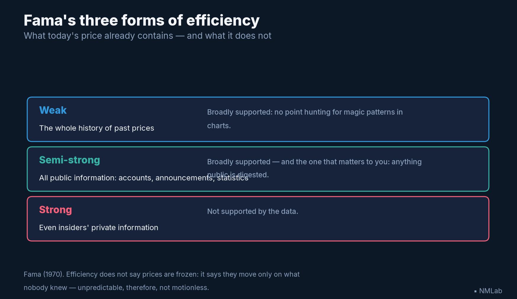
Three degrees, only one of which decides your fate as an investor: the semi-strong. Whatever you read in the press is already fully contained in it.

The principle has been familiar since the panorama of chapter 4; efficiency gives it its foundation — and its most frequent misreading. "Everything is in the price, so nothing moves": false. Efficiency does not say prices are frozen; it says they move only when new information arrives — that is, a surprise. Today's price already contains all we know; it will change only on what we did not know. An efficient market is not motionless: it is unpredictable, which is not the same thing. Hold on to this shift, because it commands all the rest: markets react not to levels, but to the gaps from what was expected. An "excellent" growth figure can sink a stock market, if it falls a notch below what the consensus hoped for; a "mediocre" figure can send it soaring, if it is less bad than feared. It is not the news that counts, it is its distance from the expected.
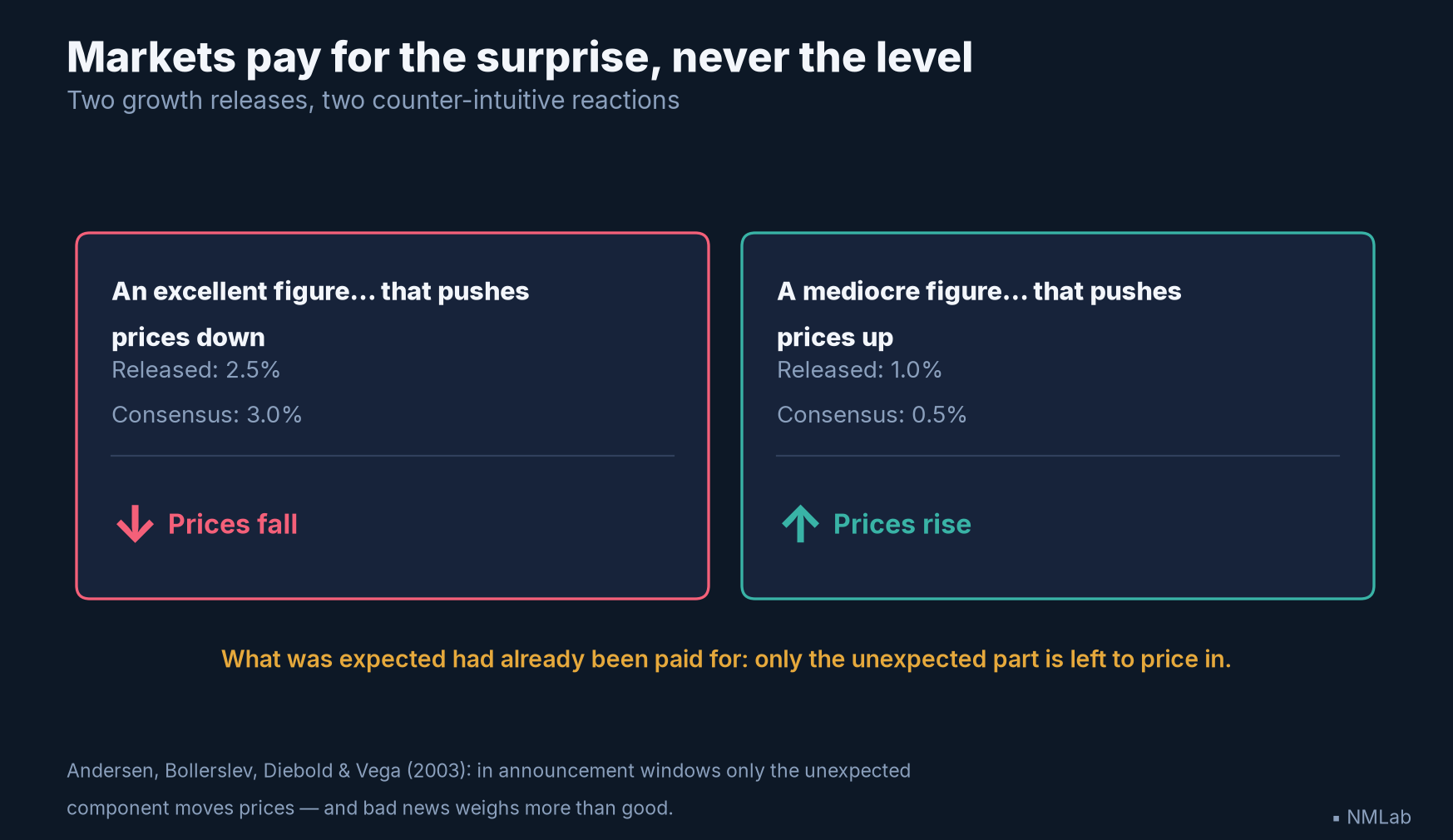
Two symmetric cases, two reactions common sense refuses — until you realise the expected level had already been paid for.
Researchers have measured it up close. Torben Andersen and co-authors, in a landmark 2003 study, dissected the currency market's reaction, minute by minute, to U.S. macroeconomic announcements. Their result is unambiguous: only the unexpected component of the announcement — the surprise, the gap between the published figure and the expected one — moves prices. The rest, the anticipated part, does nothing. In the announcement windows alone, this surprise explains as much as 30 to 60% of the move. And they note an asymmetry that should stay with you: bad news weighs more heavily than good. That is why a whole industry busies itself guessing not the figure, but the expected figure — the consensus. Forecaster surveys, unofficial whisper numbers, nowcasts like the Atlanta Fed's GDPNow that reconstructs GDP in real time: all this apparatus serves only to set the bar that reality will have to clear. Beating the consensus is what pays; the consensus itself, however accurate, is already in the price.
Why growth doesn't pay (except by surprise)
That leaves the mechanism by which known growth turns into mediocre return. It fits in a formula, the simplest in finance, Gordon's (1956): the price of a stock equals the expected dividend divided by the gap between the required return and the expected growth. In plain terms: Price = dividend ÷ (required return − growth).
Read this fraction slowly. The higher the expected growth, the smaller the denominator, the higher the price you pay today. Anticipated growth is not handed to you: it is billed in advance, in the form of a high entry price. And for a given future stream of dividends, the more you pay to get in, the lower your future return. Growth therefore only "pays" if it exceeds what was already discounted in the price; delivered exactly as expected, it earns nothing beyond the required return. It is the BRIC fund in one equation.
A concrete example. Two companies pay the same dividend, one euro. Investors require 8% return on each. One expects 2% growth for the first, 6% for the second. The formula gives a price of €17 for the first (1 ÷ 0.06), but €50 for the second (1 ÷ 0.02): three times dearer, purely because it is credited with stronger growth. Yet if both keep their promise exactly, the investor in each ends up earning their 8%, no more, no less. The growth bet earned nothing extra — it only made you pay more. It would have paid only if the second company had grown faster than the 6% already in its price; and it would have punished you if it had grown even a little less. The whole game is played at the margin, around the expected.
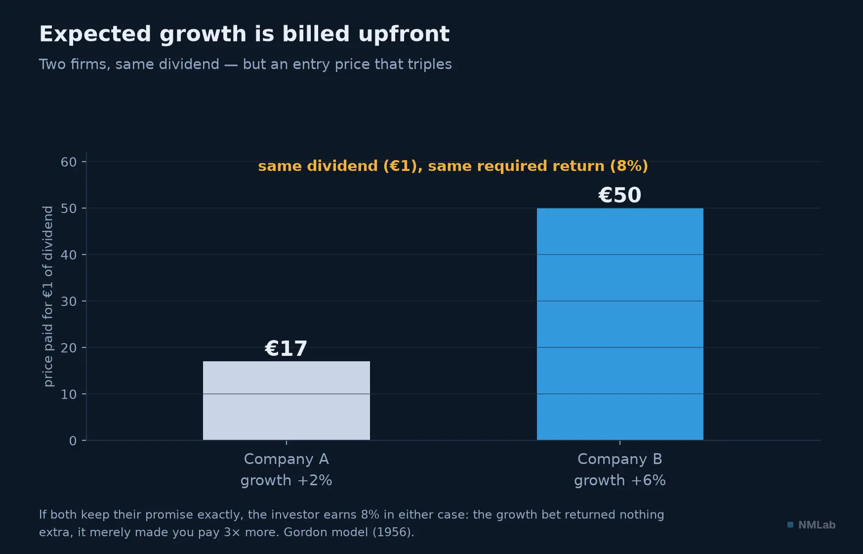
Paying €50 instead of €17 for the same promise kept means accepting the same final return in advance: expected growth is already in the entry price.
This is not theory. The most robust proof comes from valuation itself. Take Robert Shiller's CAPE — the price/earnings ratio smoothed over ten years, a measure of the market's "expensiveness" — and set it against the real return that U.S. stocks actually delivered over the following ten years, since 1881. The cloud is eloquent.
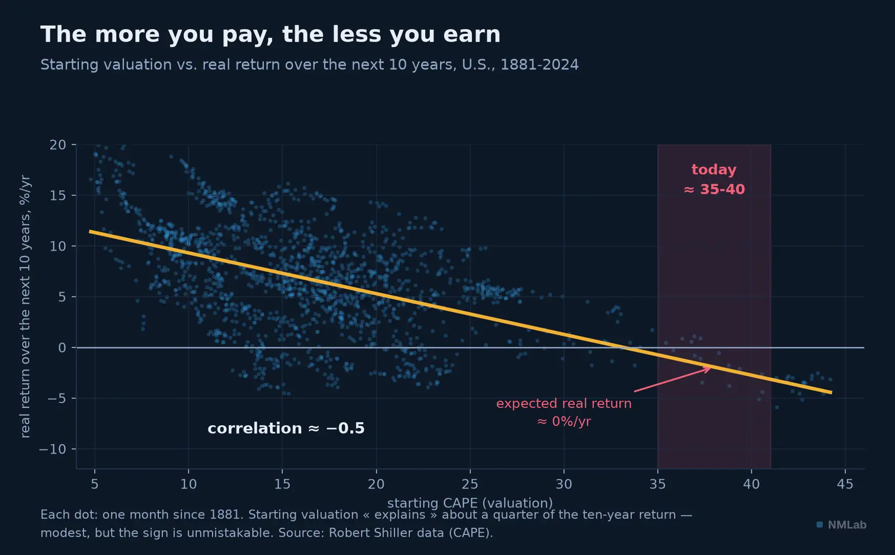
Each dot is a month since 1881. The slope is clear: starting from a high valuation condemns your ten-year return. The correlation, about −0.5, explains only a quarter of the story — but the sign never deceives.
The correlation is about −0.5: the starting valuation "explains" only a quarter of the variance in the ten-year return — modest, honestly. The price does not say when or by how much.
And here a caveat is needed that most write-ups omit, though it is decisive: these points are not independent. Every month since 1881 supplies an observation, but two neighboring months share one hundred and nineteen of their hundred and twenty months of return — their windows almost entirely overlap. The eye believes it sees seventeen hundred observations; the real information holds about fifteen, the number of genuinely distinct decades. William Goetzmann and Philippe Jorion showed this as early as 1993 on the dividend yield, and Rossen Valkanov generalized it in 2003: long-horizon regressions on overlapping data produce inflated t-statistics and flattering R², and a good part of the "predictability" attributed to them does not survive a serious correction. Take this scatter for what it is: a regularity whose sign is robust, whose magnitude is not, and whose statistical significance is far weaker than it looks.
That said, the sign itself has held for a century and a half: buy dear, earn little. And where do we stand today?
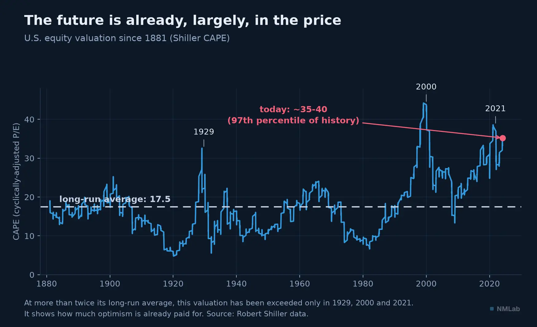
At more than twice its long-run average of 17.4, U.S. valuation yields only to the December 1999 peak (44.2). The curve stops at the figure's vintage; as of July 24, 2026, the CAPE stands at 40.5. The market has almost never discounted the future so much.
The U.S. CAPE stands at 40.5 on July 24, 2026: more than twice its long-run average of 17.4, and a level that only the peak of the internet bubble, in December 1999 (44.2), has exceeded since 1881 — it now sits above the peaks of 1929 and 2021. Extended mechanically, the historical relationship promises a real return near zero for the decade. This is not a prediction — the cloud is too scattered for that — but a quantified warning: much of future growth is already paid for. You recognize here the thread of chapter 11, where we saw that a country's growth does not predict its stock market's return. Here is the mechanism: expected growth is in the price; only the unexpected pays.
The surprise that pays
The story has a flip side, and a cheering one: if buying anticipated growth disappoints, buying despair can enrich. For the symmetry is perfect — when the worst is already in the price, it need only fail to arrive for the market to soar. The purest example is recent. In late 2022, certainty of a U.S. recession was total: on October 17, the Bloomberg Economics model showed 100% probability of recession within the year. The consensus was unanimous, the case closed. And 2023? No recession — and an S&P 500 up 26% including dividends.
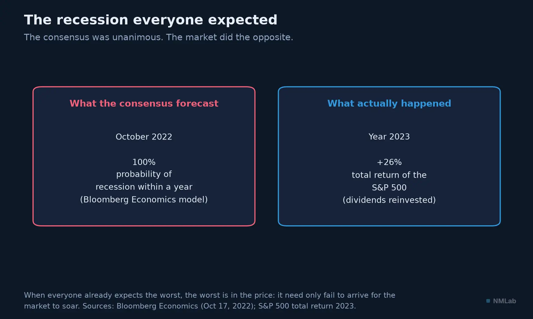
Two cards, one lesson. The most unanimous consensus is the most dangerous: when everyone already expects the worst, it is already in the price, and it is its absence that becomes the news.
Beware the precision, because the popular story distorts the fact: that 100% was that of a statistical model at Bloomberg Economics, not a survey of economists (which put it closer to 60%). The nuance changes nothing in the lesson: pessimism, when it is consensual, is an asset in the price, and its disappointment pays. We had seen the same spring on March 23, 2020, when the S&P 500 hit its pandemic-panic low, at 2,237 points, 34% below its peak — only to rebound at once, weeks before any recovery data. The market does not wait for the good news; it buys the fact that it has become less improbable than feared.
So is macro any use for investing?
An honest question then arises, and it is awkward for a whole module devoted to macroeconomics: if everything foreseeable is in the price, what is the point of reading GDP figures? The skeptic has ammunition. "Global macro" funds bet precisely on the great economic trends. Their 2010s were mediocre: single-digit, subdued returns in a world of low rates and low volatility. And they still lag equities. In 2023, the S&P 500 gained 26%; the Barclay Global Macro index did less than 5%. The line attributed to Peter Lynch sums up the opposing camp: "If you spend 13 minutes a year on economics, you've wasted 10 minutes." Focus on companies, he says, not on macro forecasts no one gets right. And this chapter's logic partly proves him right: if foreseeable macro is in the price, the most gifted macro forecaster holds, by construction, no edge — chasing information the market already owns.
And yet the conclusion "macro is useless" would be a beginner's mistake. Those who defend it best do not claim to predict. Howard Marks put it in a memo that became famous, in November 2001, whose title is a whole program: "You can't predict. You can prepare." We do not know the future, but we can know where we stand in the cycle — near an excess or an abyss — and calibrate our risk accordingly. It is also the whole point of Ray Dalio and his "economic machine": macro is not for guessing the next quarter, it is for recognizing the regime and dosing exposure.
There is the synthesis of the whole module. Macroeconomics is not a crystal ball for anticipating the market — the market has already read the same figures as you. It is a map of risks: it tells you when valuations are stretched (as today), when euphoria or panic are consensual, when the price of time is low or high. It will not make you beat the market in the short run. It can spare you from buying growth at its dearest, and selling despair at its cheapest — which, over an investing lifetime, makes all the difference.
Key takeaways
- Growth ≠ return — The BRICs delivered the promised growth; Goldman's BRIC fund lost about 21% over five years before it closed, while its assets under management fell roughly 88% from their peak. Its creator "never put a cent" into it. Predictable growth is already in the price.
- "It's priced in" — An efficient market (Fama, 1970) incorporates all that is known. It moves only on the surprise, the gap from consensus — not on the level. Efficiency does not mean motionlessness, but unpredictability.
- Markets react to surprises — Andersen et al. (2003): only the unexpected component of an announcement moves prices (up to 30-60% of the move in the announcement window), and bad news weighs more than good.
- Why growth doesn't pay — Price = dividend ÷ (required return − growth): high expected growth inflates the entry price and lowers the future return. It pays only if it exceeds what is discounted.
- Valuation warns — CAPE explains about a quarter of the ten-year return (correlation ≈ −0.5); the sign has been constant since 1881. ⚠️ Overlapping windows: ~15 independent decades, not 1,700 months — significance far weaker than it looks (Goetzmann-Jorion, Valkanov). At 40.5 (July 24, 2026) — a level only December 1999 has exceeded — it points to a real return near zero for the decade.
- The surprise pays — Late 2022, recession put at 100% (Bloomberg model); in 2023, S&P 500 +26%. When the worst is in the price, its absence alone lifts the market.
- What macro is for — Not to predict (the market read the same figures), but to prepare: "You can't predict. You can prepare." (Marks). A map of risks and regimes, not a crystal ball.
The journey ahead
Here ends Module 2. You set out from a simple question — what is GDP? — and here you are, able to read a country's wealth, to distinguish its real growth from the illusion of prices, to weigh productivity, demography, saving and climate, to download the series yourself and chart them — and, above all, to know what all this is worth, or not worth, for placing your money. The great lesson fits in a sentence: macroeconomics is not played against the market, it is played to understand the world in which the market moves. The journey, for its part, continues: after the wealth produced come the money that measures it, the inflation that erodes it, and the debt that finances it. Next chapter, opening Module 3: "What Is Money? Origins and Functions". Until then, one last exercise: look up the current CAPE of your favorite market, and ask yourself, honestly, how much of the future you are already paying for.
Sources and references
- Jim O'Neill, "Building Better Global Economic BRICs," Goldman Sachs Global Economics Paper No. 66, November 30, 2001 — the coining of the BRIC acronym (a geopolitical thesis, not investment advice).
- Goldman Sachs BRIC Fund: launched June 30, 2006; closed and merged into the Goldman Sachs Emerging Markets Equity Fund at the close of October 23, 2015 (a little over 100 million U.S. dollars in assets remaining). Over the five years before closure, the fund's value fell by about 21%; it was assets under management, not the value of an investment, that declined roughly 88% from their 2010 peak. Performance and merger details appear in the SEC filing; the asset figures and O'Neill quotation were reported by Bloomberg ("Goldman's BRIC Era Ends," November 8, 2015; "As BRIC Fund Assets Collapse, Jim O'Neill Is Keeping Away," March 25, 2022).
- Eugene F. Fama, "Efficient Capital Markets: A Review of Theory and Empirical Work", Journal of Finance 25(2), 1970, pp. 383-417 — prices that "fully reflect" information; the weak, semi-strong and strong forms of efficiency.
- Torben G. Andersen, Tim Bollerslev, Francis X. Diebold & Clara Vega, "Micro Effects of Macro Announcements: Real-Time Price Discovery in Foreign Exchange", American Economic Review 93(1), 2003, pp. 38-62 — only the standardized surprise moves prices; the asymmetry "bad news has greater impact than good news."
- Myron J. Gordon & Eli Shapiro, "Capital Equipment Analysis: The Required Rate of Profit", Management Science 3(1), 1956, pp. 102-110 — the Price = D₁ / (r − g) model.
- William N. Goetzmann & Philippe Jorion, "Testing the Predictive Power of Dividend Yields", Journal of Finance 48(2), 1993; Rossen Valkanov, "Long-horizon regressions: theoretical results and applications", Journal of Financial Economics 68(2), 2003 — the bias of long-horizon regressions on overlapping windows.
- Robert J. Shiller, historical CAPE and real-return data (ie_data.xls) — the correlation (≈ −0.5) computed on the series since 1881, September 2024 vintage; current CAPE level (40.5), long-run average (17.4) and the December 1999 record (44.2) as of July 24, 2026.
- Bloomberg Economics (Anna Wong & Eliza Winger), probabilistic model putting the probability of recession within a year at 100%, October 17, 2022; to be distinguished from the economist survey (≈ 60%). S&P 500 total return in 2023: +26.3% (price: +24.2%). Low of March 23, 2020: 2,237 points, −34% from February 19, 2020.
- Howard Marks, "You Can't Predict. You Can Prepare.," Oaktree Capital memo, November 20, 2001; Ray Dalio, "How the Economic Machine Works" (economicprinciples.org) — macro as management of regime and risk, not as prediction. The "thirteen minutes" line attributed to Peter Lynch. Barclay Global Macro index (BarclayHedge) for macro-strategy performance.
- Figure data: Robert Shiller (CAPE and real returns); Bloomberg Economics and S&P 500 total return; Goldman Sachs and Bloomberg for the BRIC paradox; Gordon model (1956) — vintage of July 16, 2026.